Modernizing smart home IoT mobile app UX for high-volume adoption
Redesigned a fragmented IoT ecosystem into a modular, card-based interface. I simplified complex device controls into a high-performance dashboard, directly improving user satisfaction and lowering cognitive load for residential users.
Industry
Year
Role
Platform

Project overview
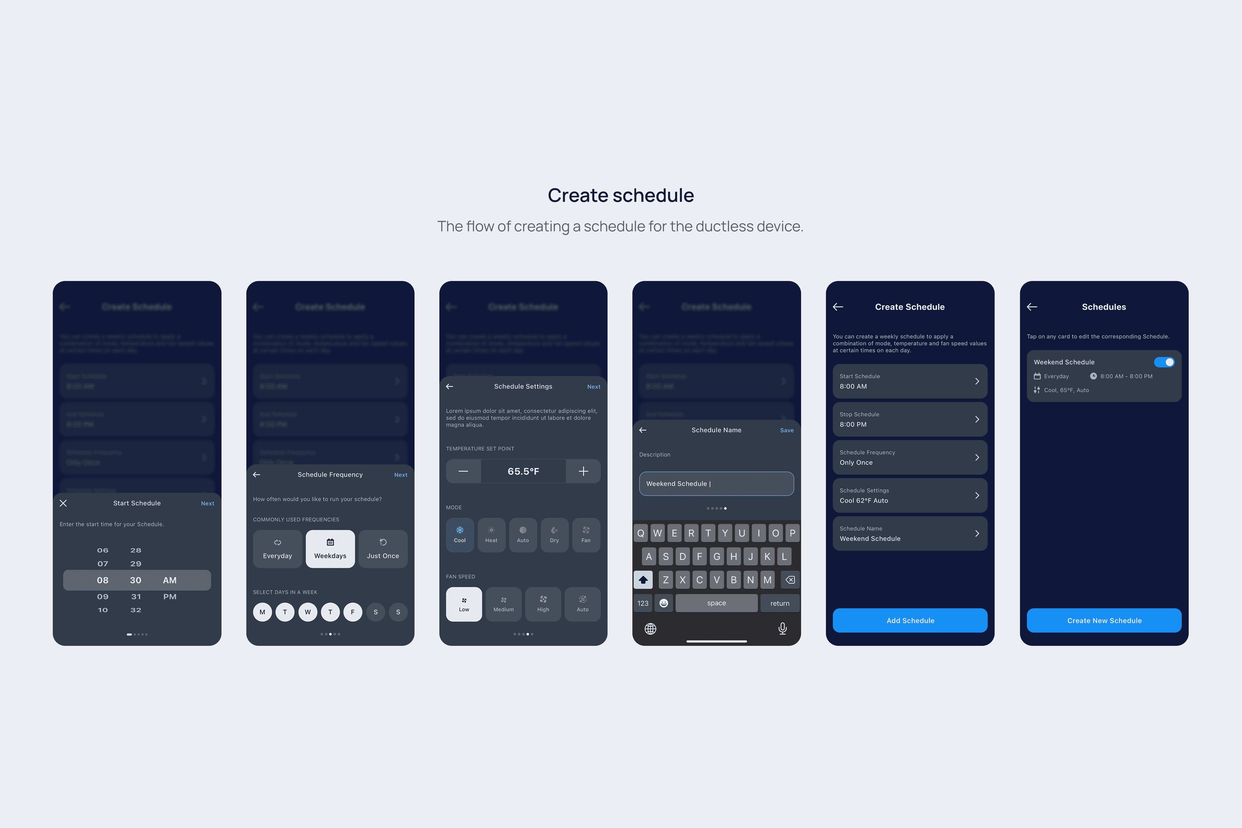
Carrier, a leading HVAC company, needed to redesign its mobile app for residential users.
My role was to lead the redesign, focusing on improving the app's overall look and feel. The primary goals were to create a scalable design system that would ensure consistency, streamline future updates, and provide users with easy, intuitive access to their device controls.
Goals & vision
Easy access to controls
Improve information architecture
Consistency and scalability
Design challenge
The mobile app, which allows users to control home devices like air quality and temperature monitors, had become outdated. Over time, piecemeal updates led to inconsistent components and a cluttered home screen that couldn't effectively manage multiple smart devices. Users found it difficult to find information, creating a frustrating experience.
A user-centered approach to design
To ensure the new design truly met user needs, we started with research to understand the users priorities.
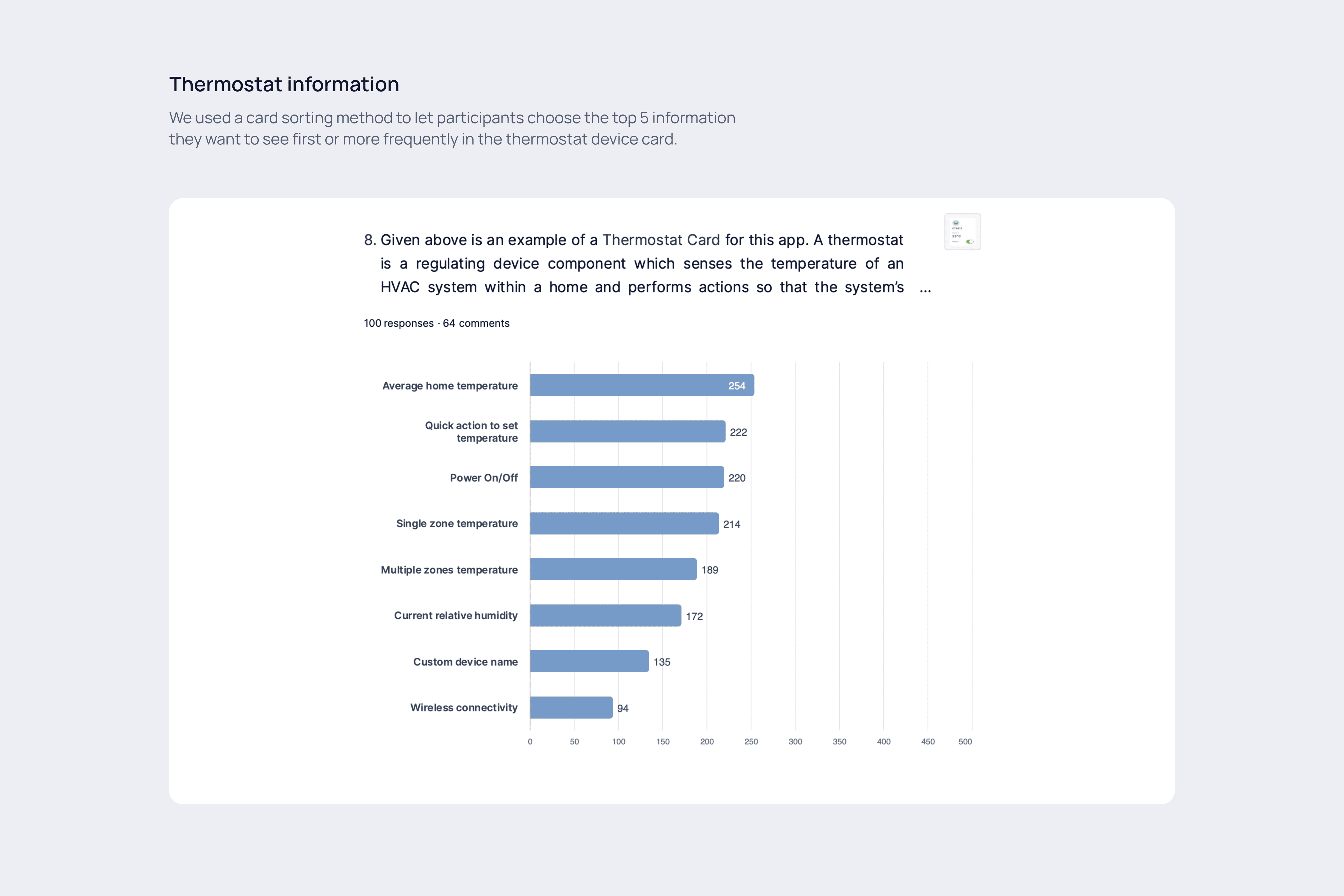
We conducted a survey to test our initial design concepts and gather insights on the app's information architecture. The feedback was clear: most users found the new direction intuitive. They also told us exactly what they wanted to see first on their dashboard.
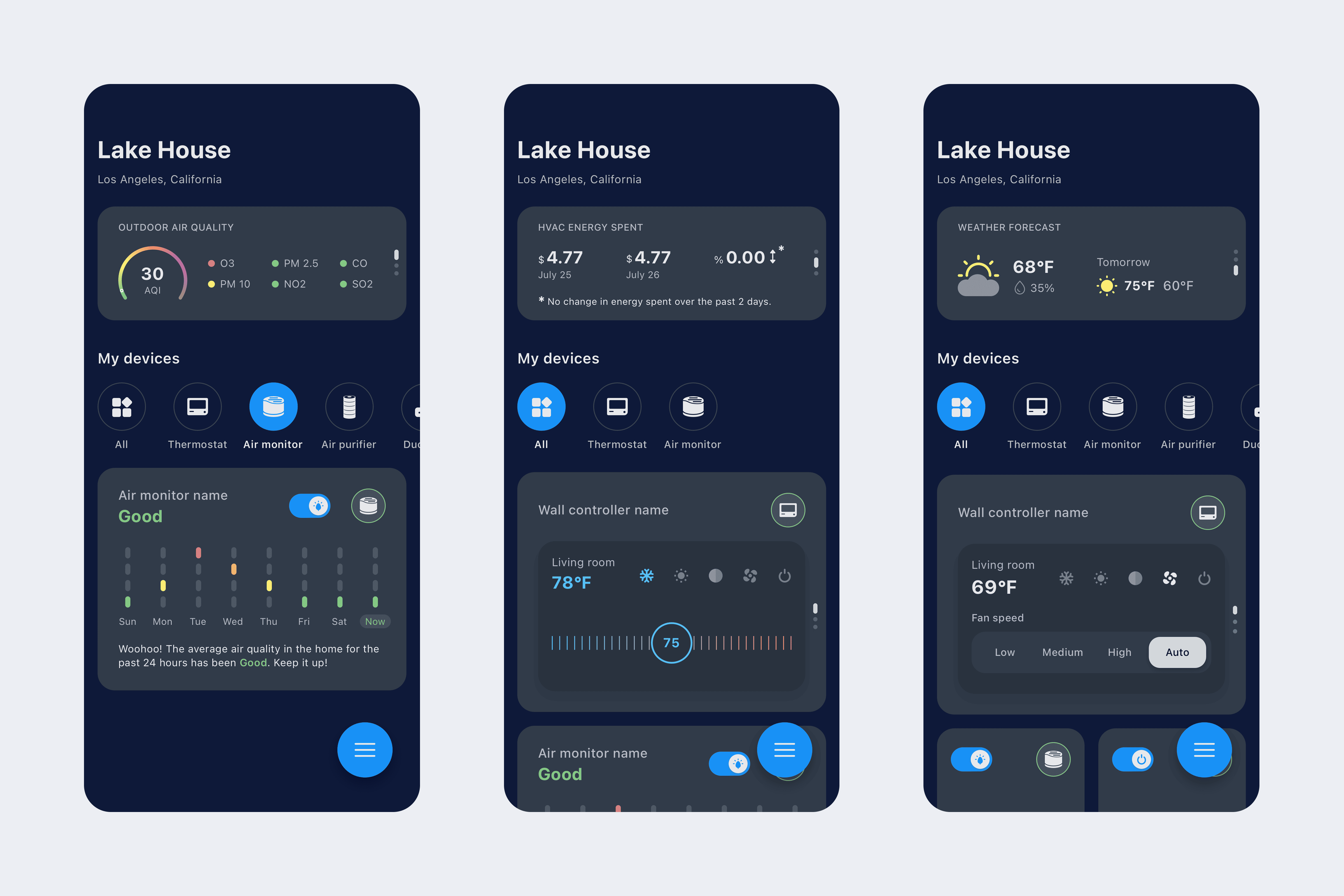
Key requests included quick access to outdoor air quality, weather forecasts, and the ability to view and adjust temperatures for multiple zones from the thermostat controls.
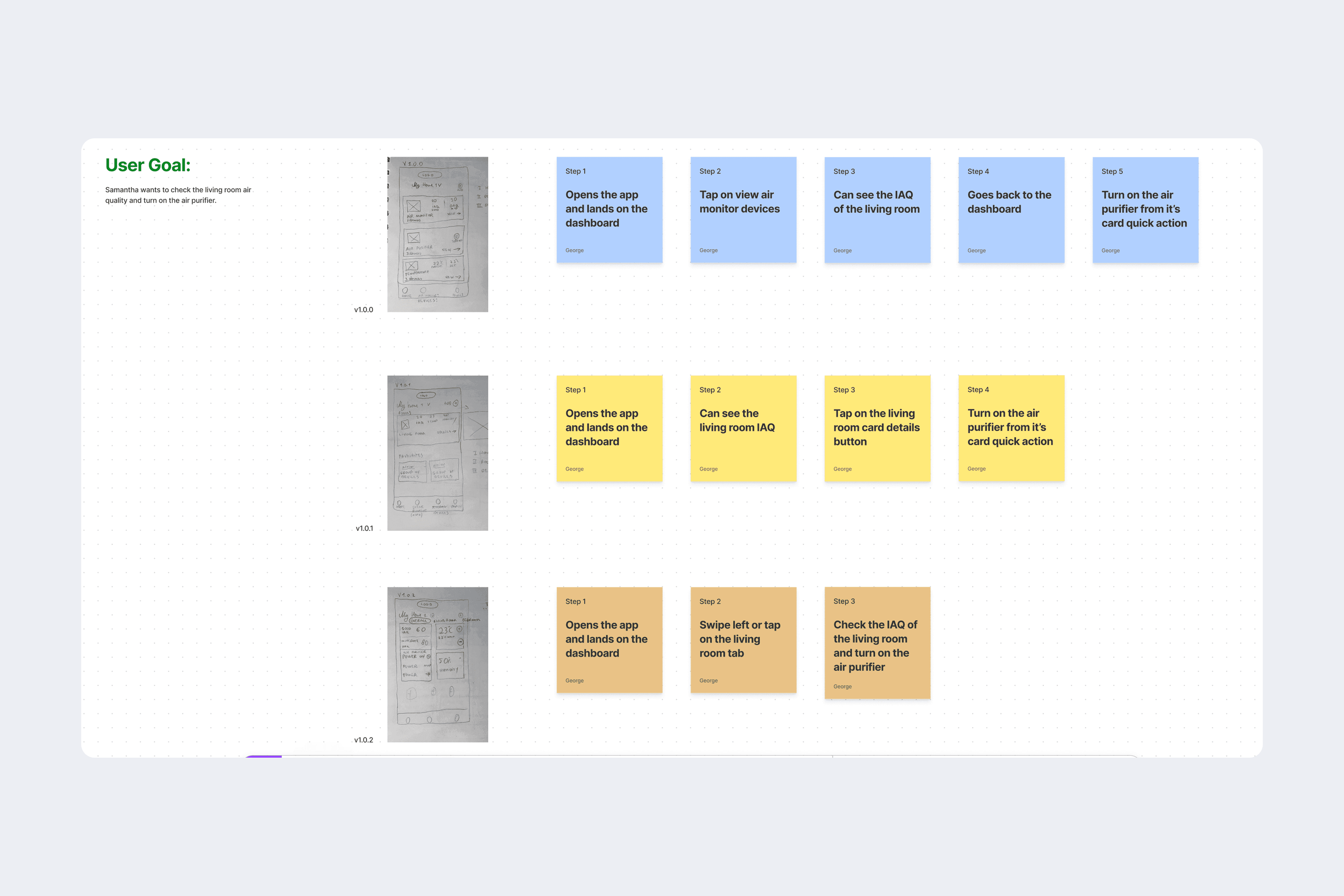
Ideation and refinement
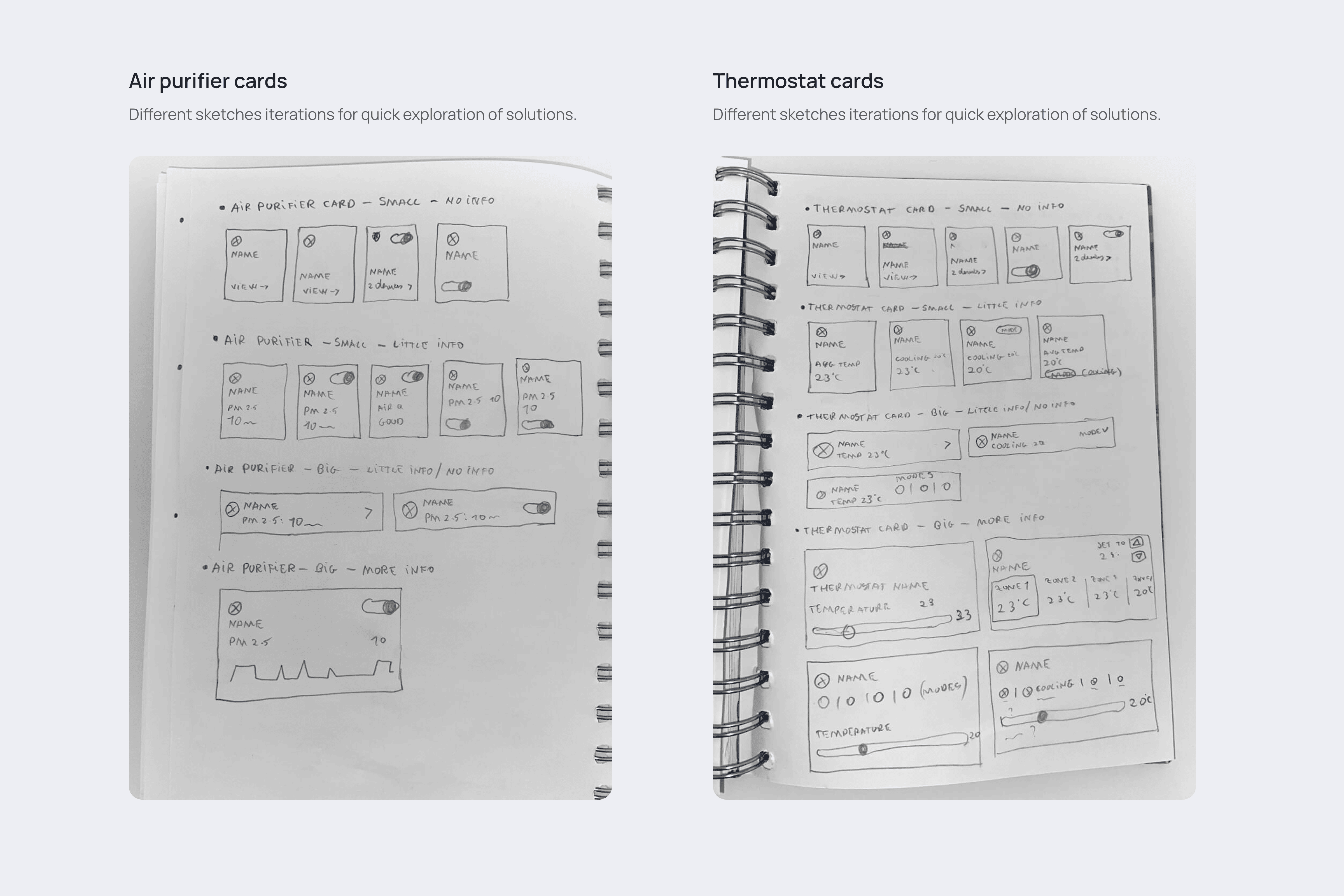
Based on the insights collected, I began iterating on the design. The main challenge was presenting a large amount of information and multiple actions without overwhelming the user.
My solution was to prioritize the most critical information at a glance, using a clean, scannable layout. I incorporated gestures to reveal more details and added quick-action buttons for the most common tasks, effectively reducing cognitive load.
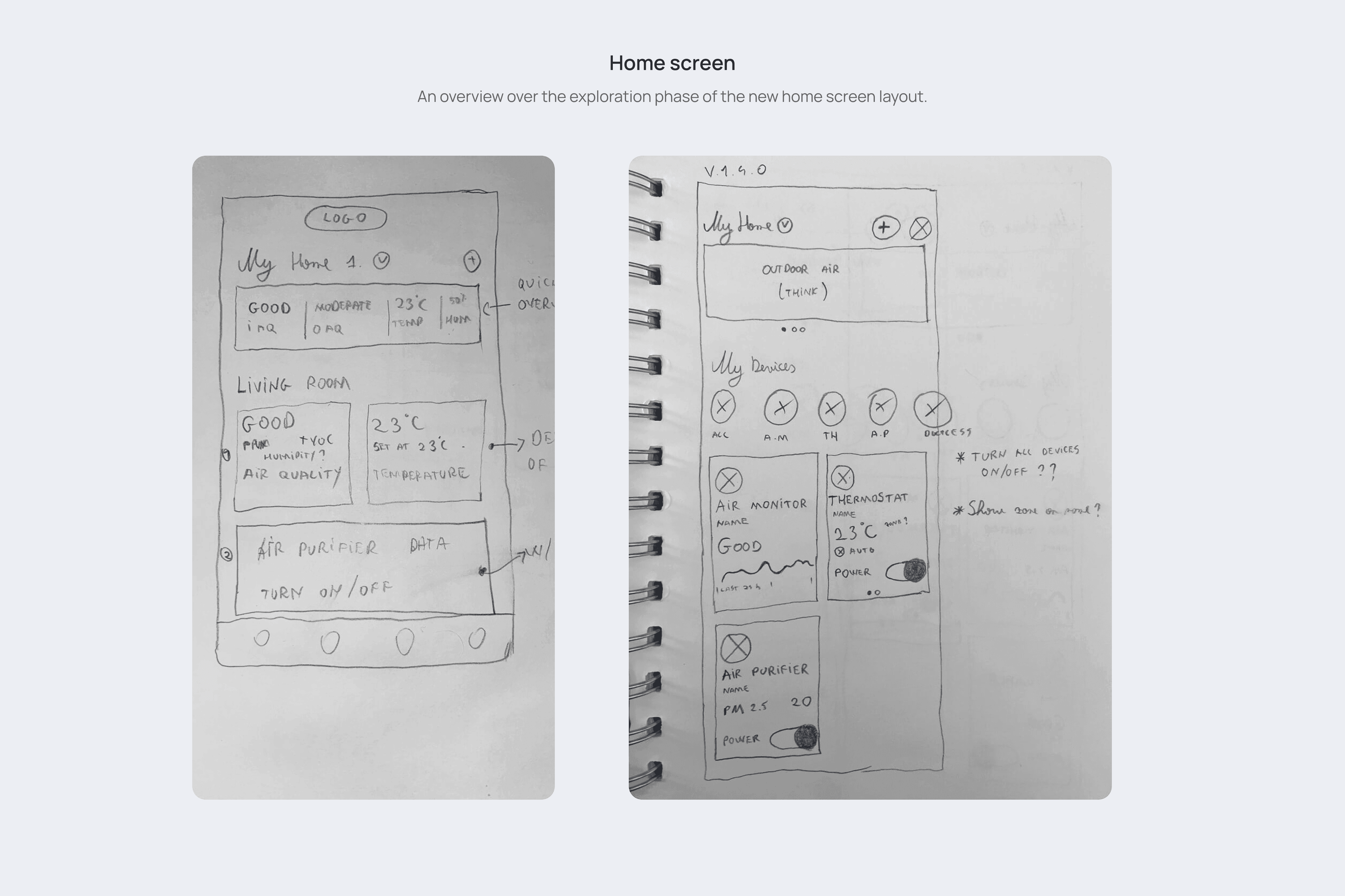
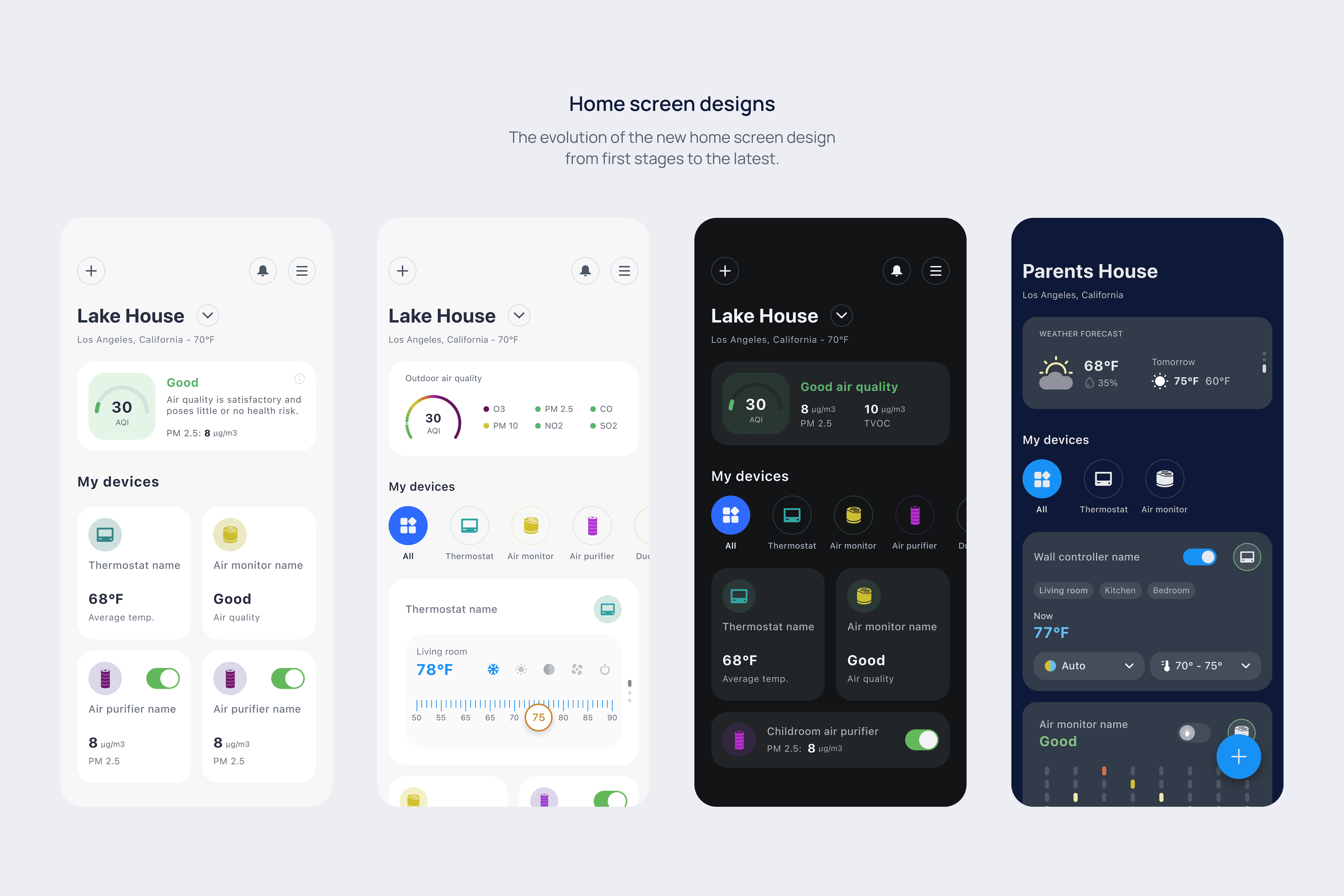
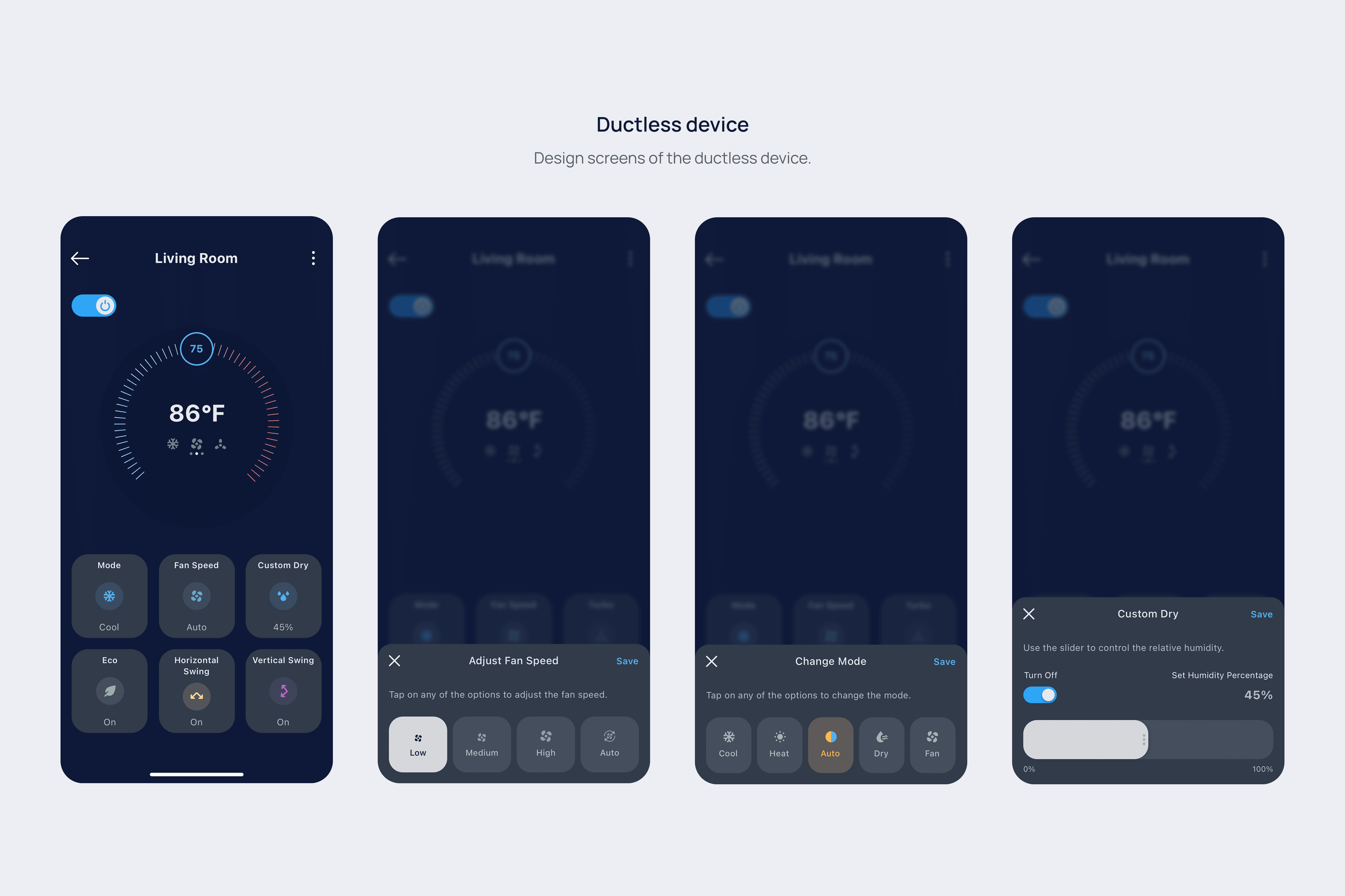
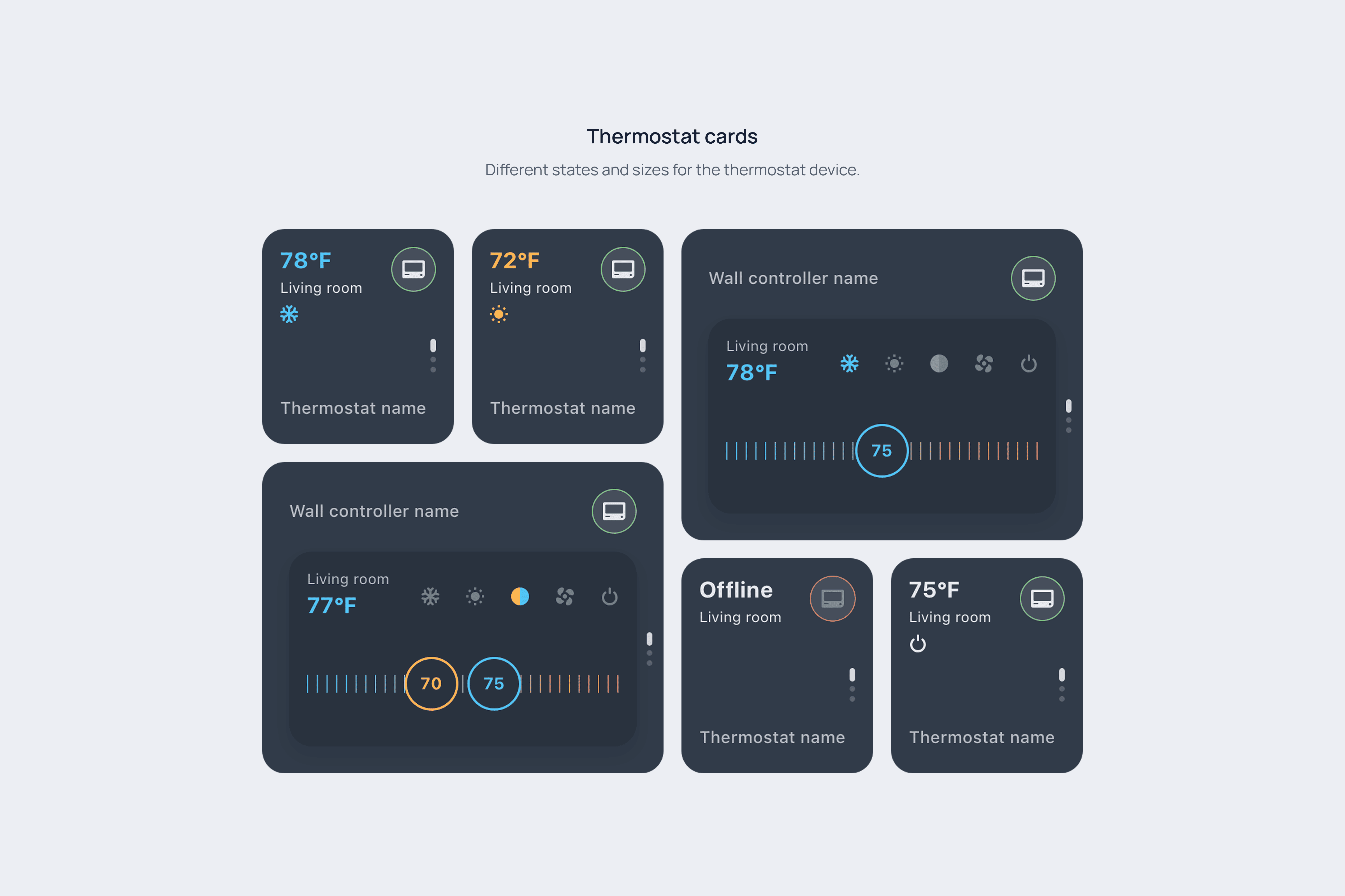
The solution: A scalable and intuitive home screen
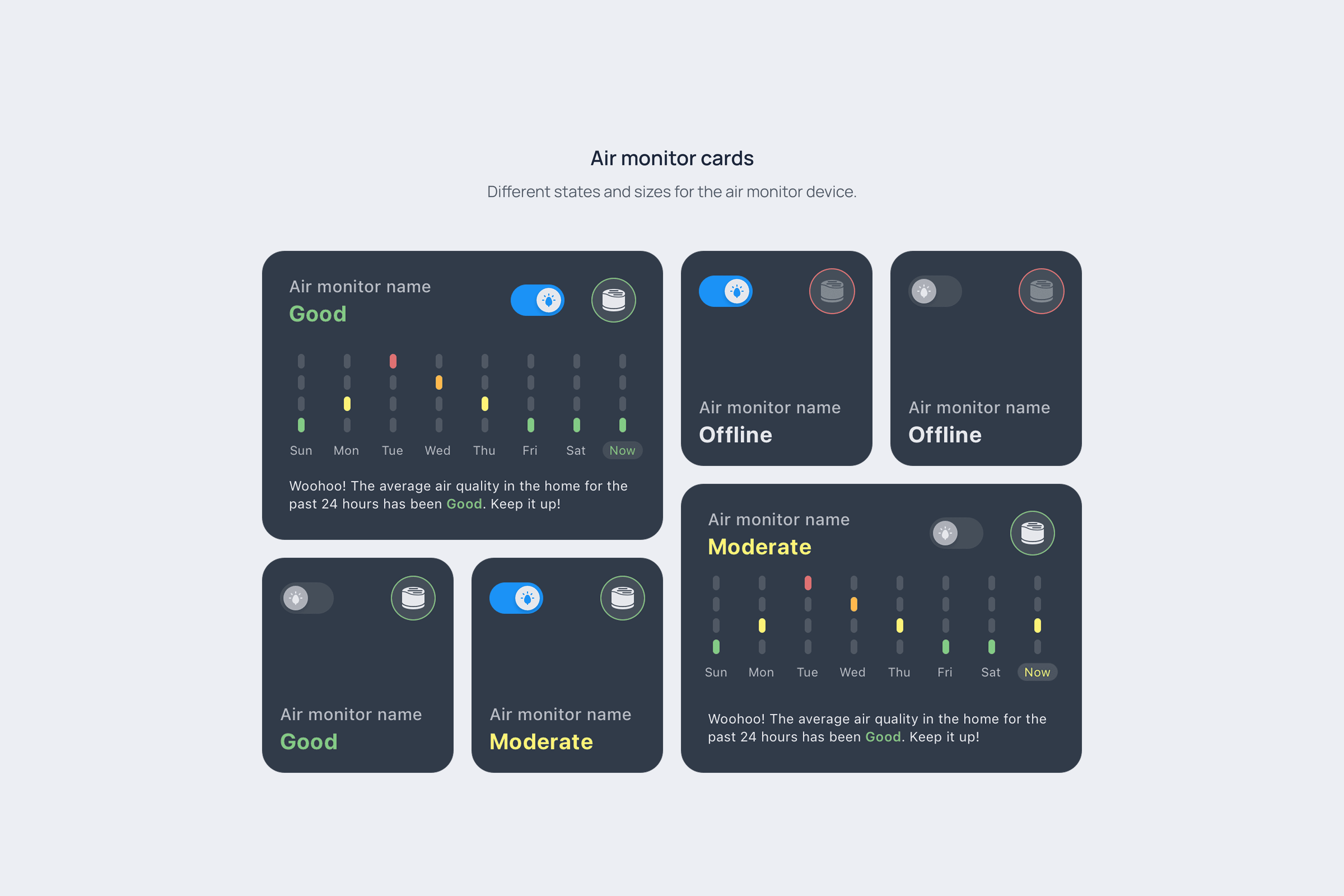
The home screen was the heart of the redesign. I developed a modular, card-based system where each card represents a specific device or piece of information.
This approach not only provides a better user experience but also creates a scalable framework that can easily accommodate new devices as users expand their smart homes.
Key design improvements
Intuitive Device Components: I designed interface elements—buttons, sliders, and menus—that felt natural and easy to use, minimizing the learning curve for new and existing users.
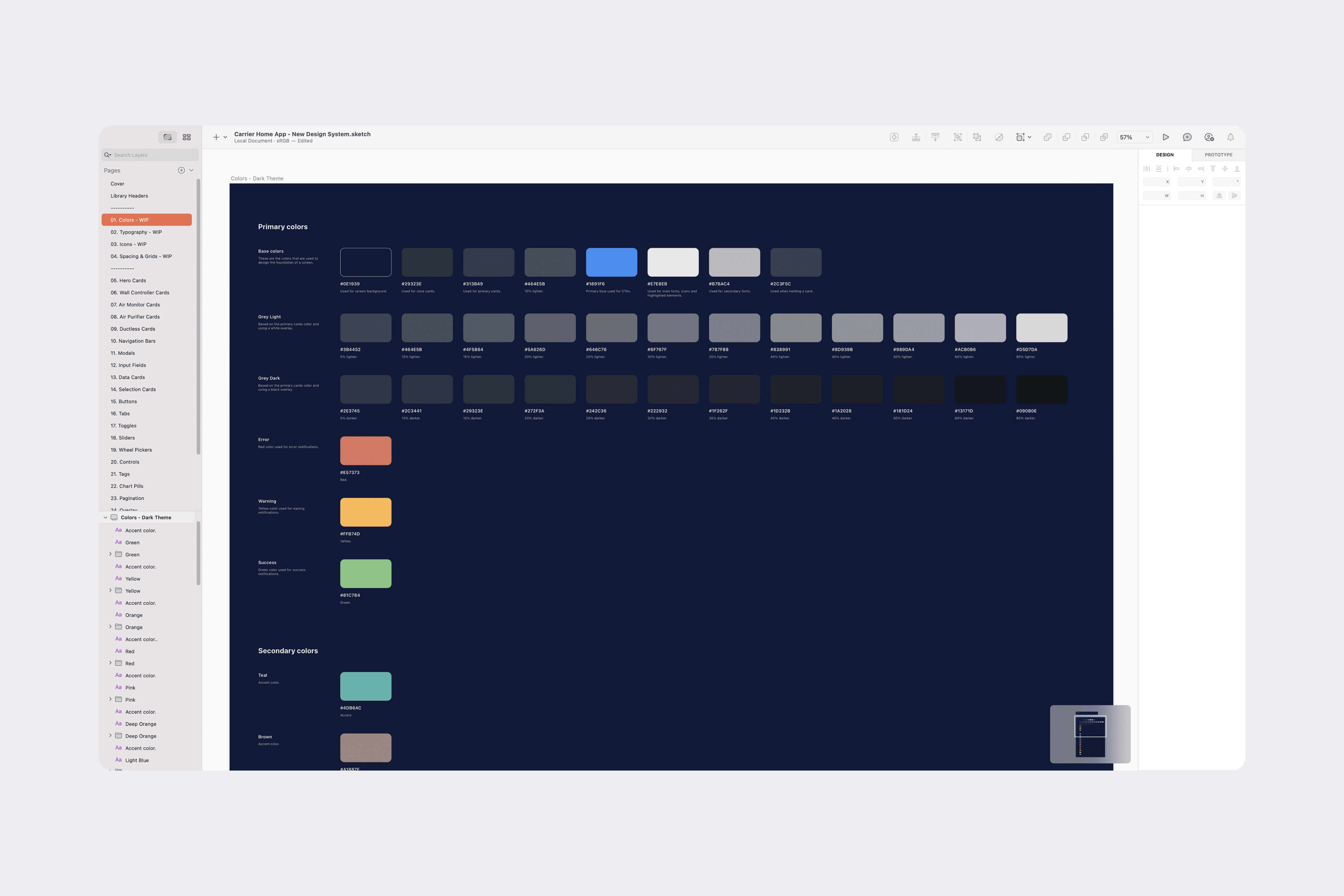
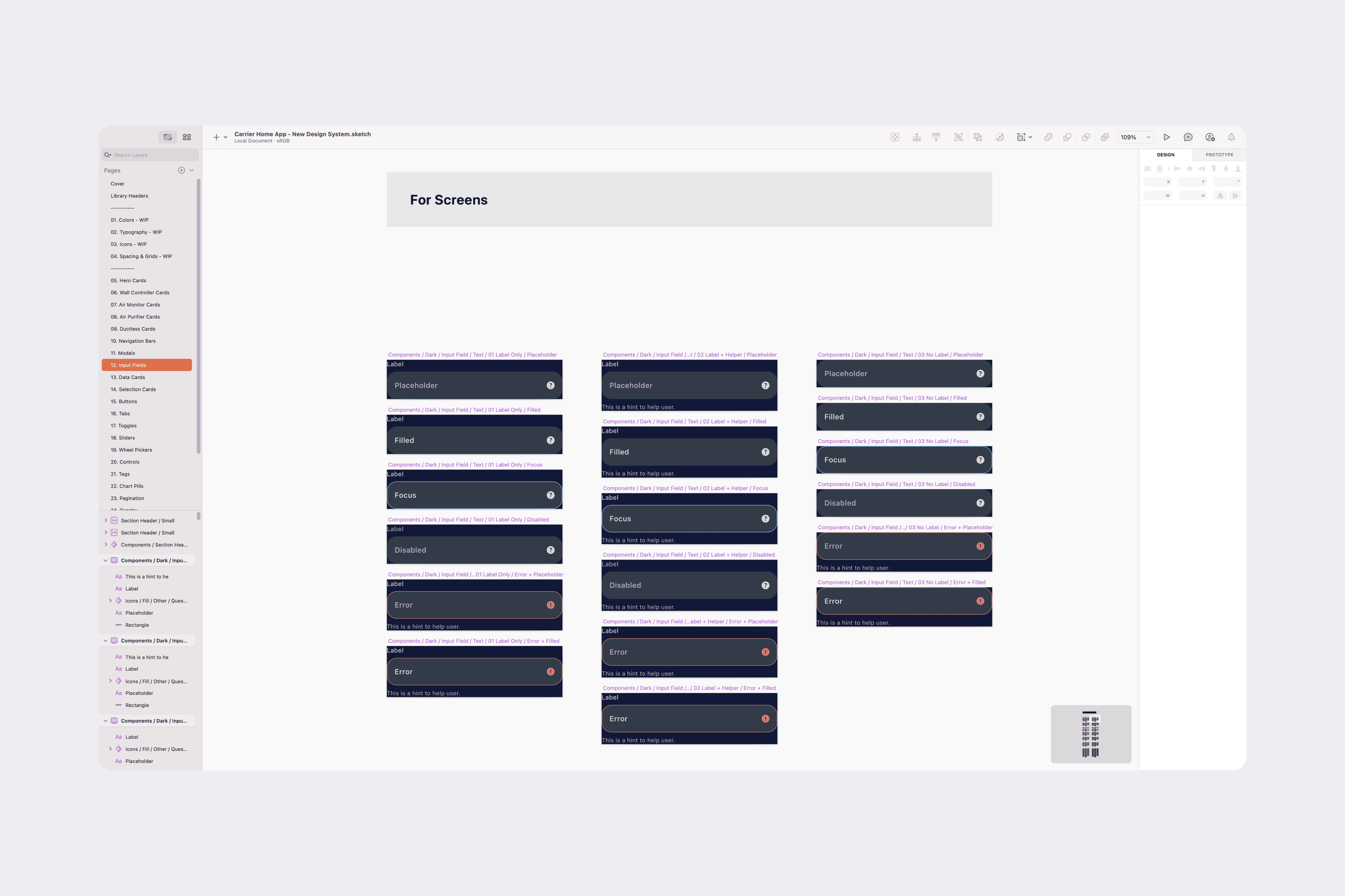
A Scalable Design System: I built a comprehensive design system with uniform typography, color schemes, and versatile components. This system acts as a single source of truth, ensuring visual consistency across the app and making future expansions faster and more efficient.
Engaging Micro-interactions: To bring the interface to life, I designed subtle animations and responses. These small, polished details guide users through their journey, providing helpful feedback and creating a more delightful and satisfying experience.
Outcome
This project was a fantastic opportunity to transform a dated app into a modern, user-friendly experience. The new design successfully addresses the core challenges of scalability and usability, providing a solid foundation for future growth.
Looking back, I would involve users even more frequently in the testing process. Continuous feedback is key to aligning with user needs quickly and effectively, and it's a lesson I've carried forward into all my subsequent projects.
Other case studies
Read the other case studies.