Optimizing property discovery and management for market scale
Redesigned the core search and management experience to eliminate user friction in property discovery. I focused on streamlining high-intent user flows to increase lead generation and provide a scalable foundation for platform growth.
Industry
Year
Role
Platform
Overview
When I joined the project, the product was still pre-launch, built on a generic front-end template primarily intended to integrate with the backend. While functional, the existing interface lacked strategic UX direction, clear user flows, and the level of refinement required to compete in the local market.
I partnered closely with the team to redefine the product from a user-experience perspective. We shifted from a template-based implementation to a purpose-driven design strategy grounded in usability, clarity, and scalability.
This involved:
Establishing clear user journeys aligned with business goals
Redefining information architecture to support complex real estate data
Prioritizing high-impact, user-centered features
Creating a cohesive design system to ensure consistency and future growth
Problem definition in the current local market
People searching for homes to buy or rent often struggle to find all the necessary property details to make informed decisions before contacting an agent or scheduling an in-person visit.
At the same time, agents and property owners who want to sell or rent their properties face uncertainty around the cost of publishing a listing. In many cases, they are required to create an account and submit property information before understanding the pricing, which creates friction and reduces trust.
Core Problems
Low-quality and incomplete property listings
Lack of a seamless, intuitive user experience
Security concerns regarding sellers’ personal information
Limited transparency in listing costs and processes
Difficulty comparing properties effectively
Absence of modern solutions tailored to different user groups
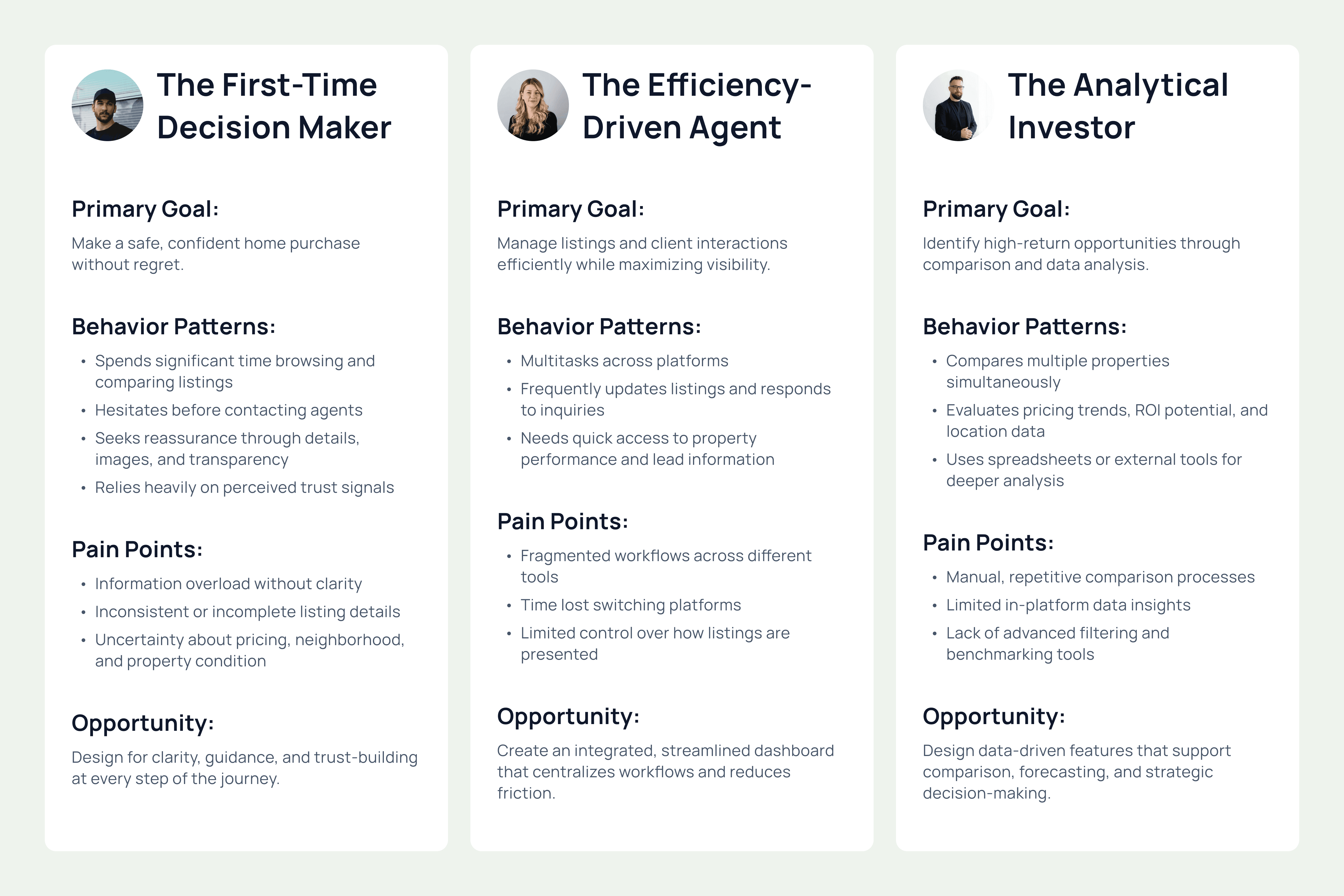
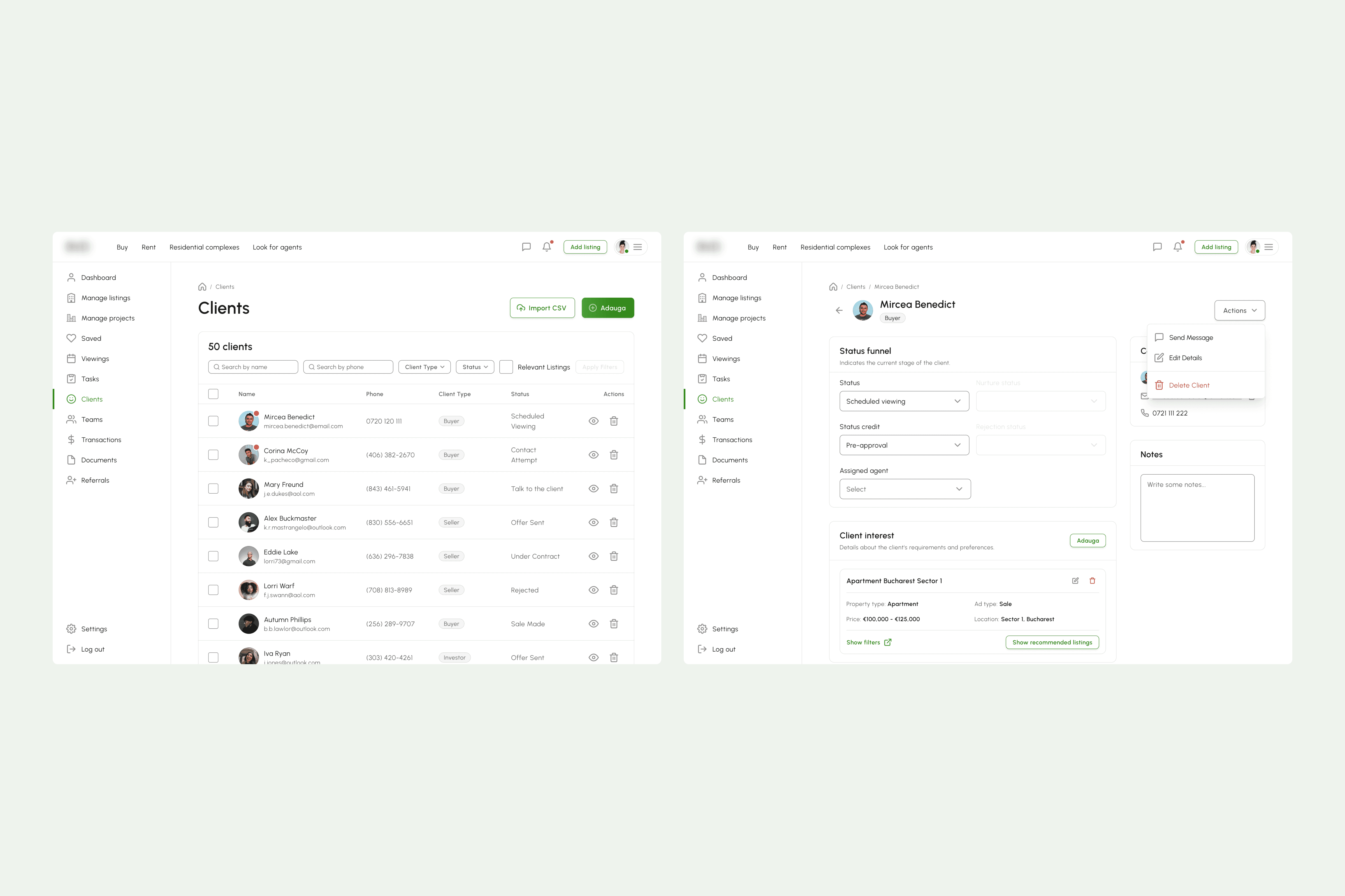
Target audience
Three key user groups, buyers, agents, and investors, shaped the design to address distinct needs, simplify decisions, and create a seamless experience.
Product Vision & Strategy
The vision was to create a modern, intuitive real estate platform that delivers a seamless experience for both property seekers and agents. The product integrates practical, high-value tools designed to help users complete their key tasks faster, with greater clarity and confidence.
From a strategic standpoint, the focus was on balancing immediate usability with long-term scalability.
For the MVP, we prioritized core functionalities that directly addressed the most critical user pain points, including:
High-quality property listings with structured information
Smart filtering and advanced comparison tools
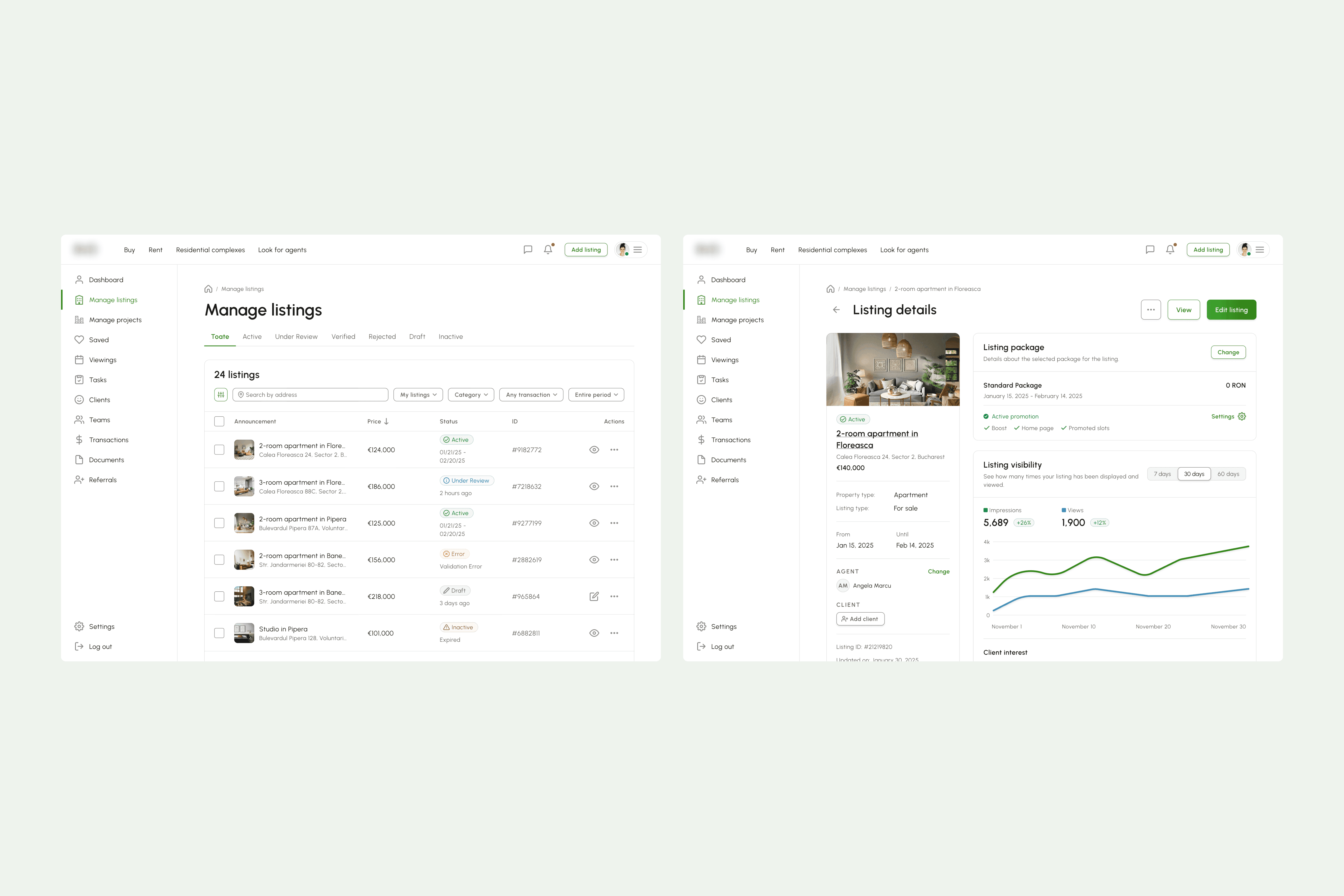
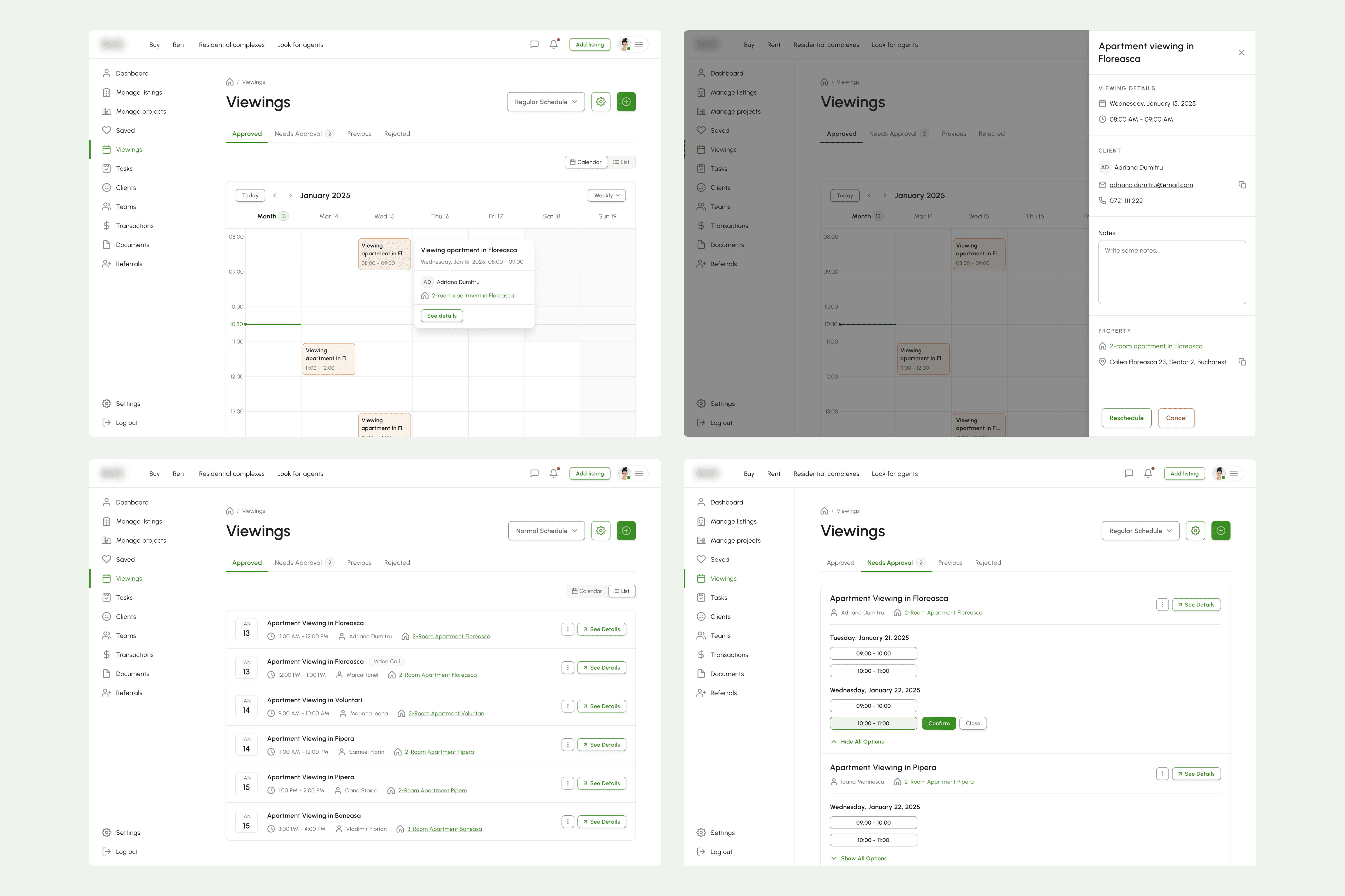
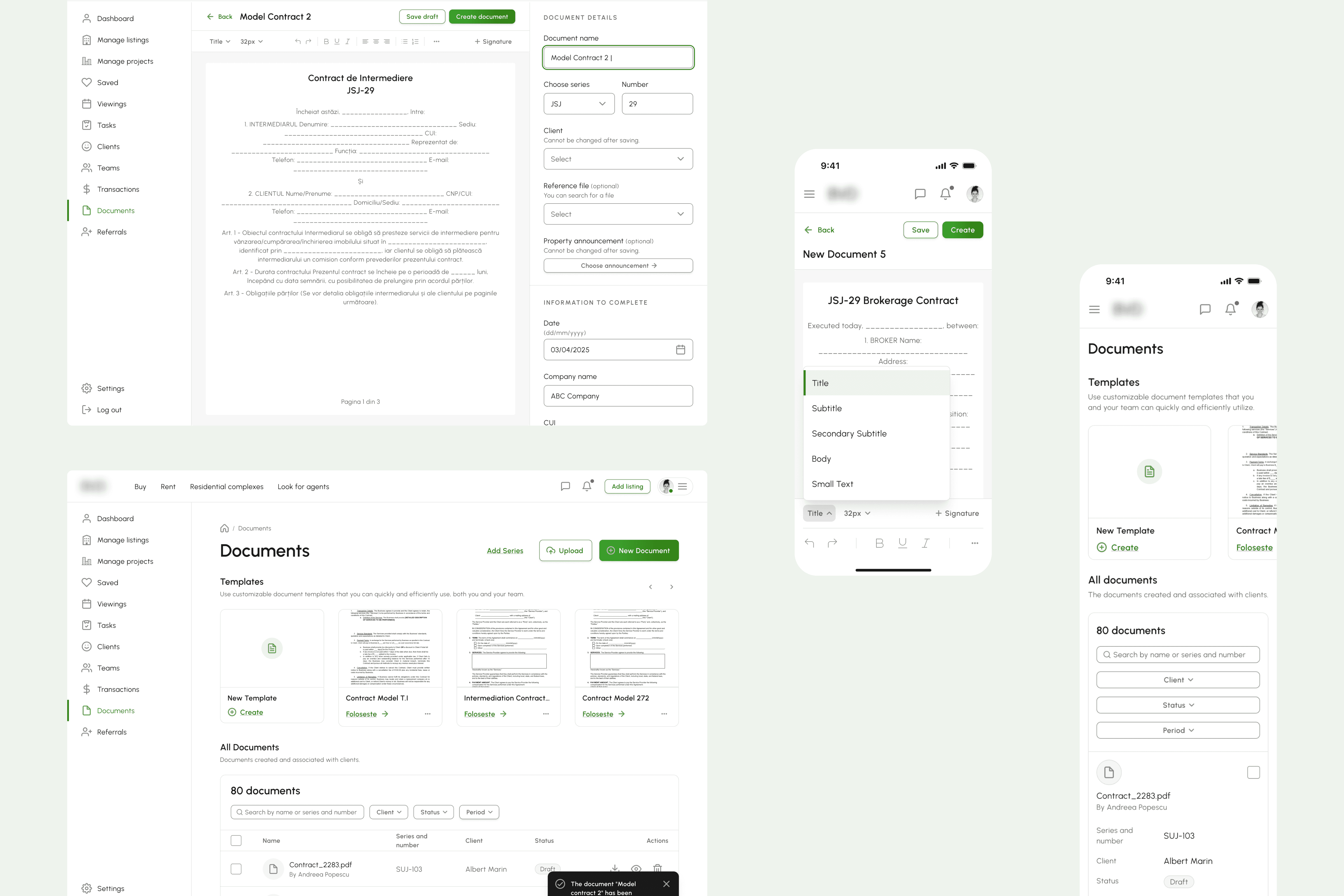
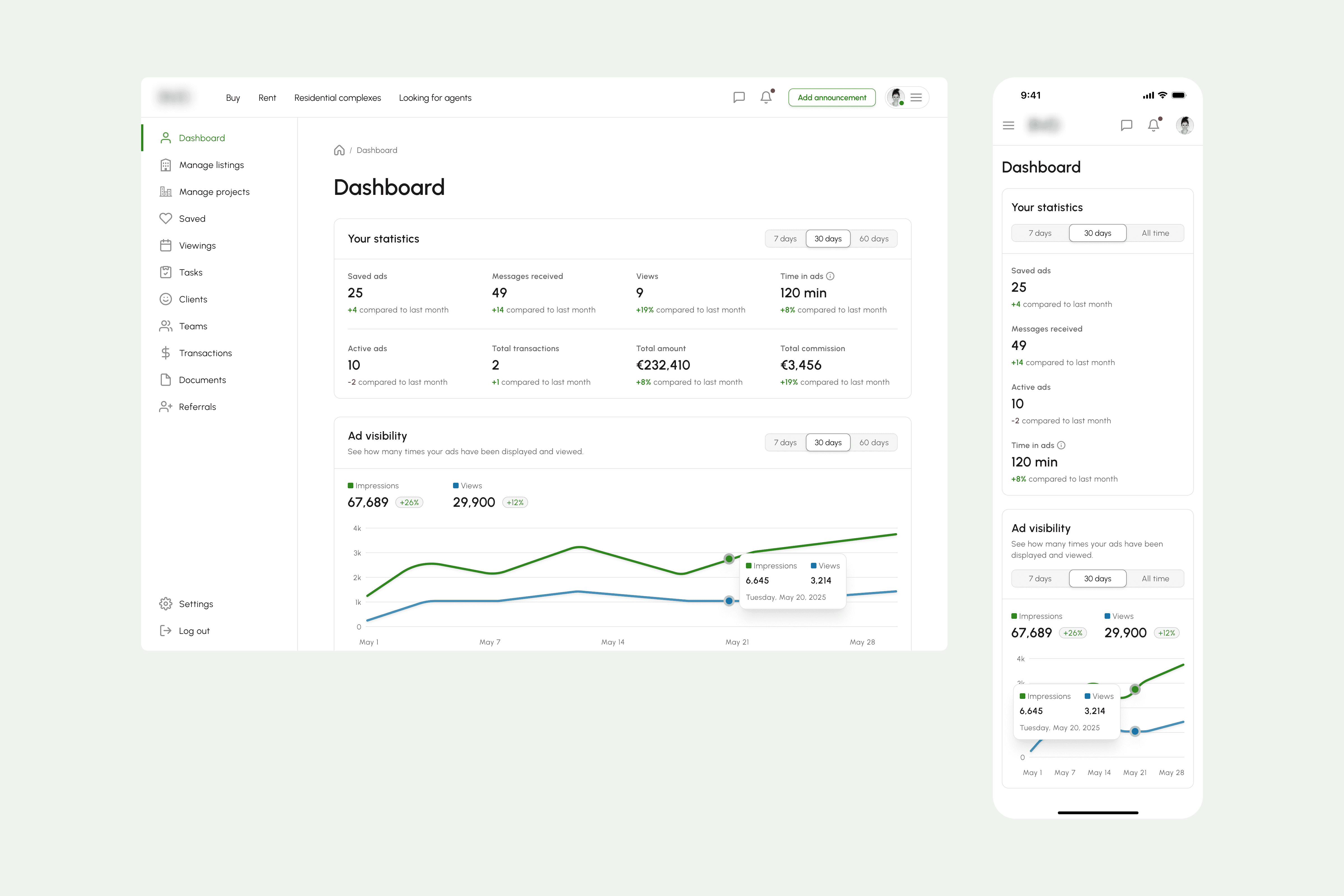
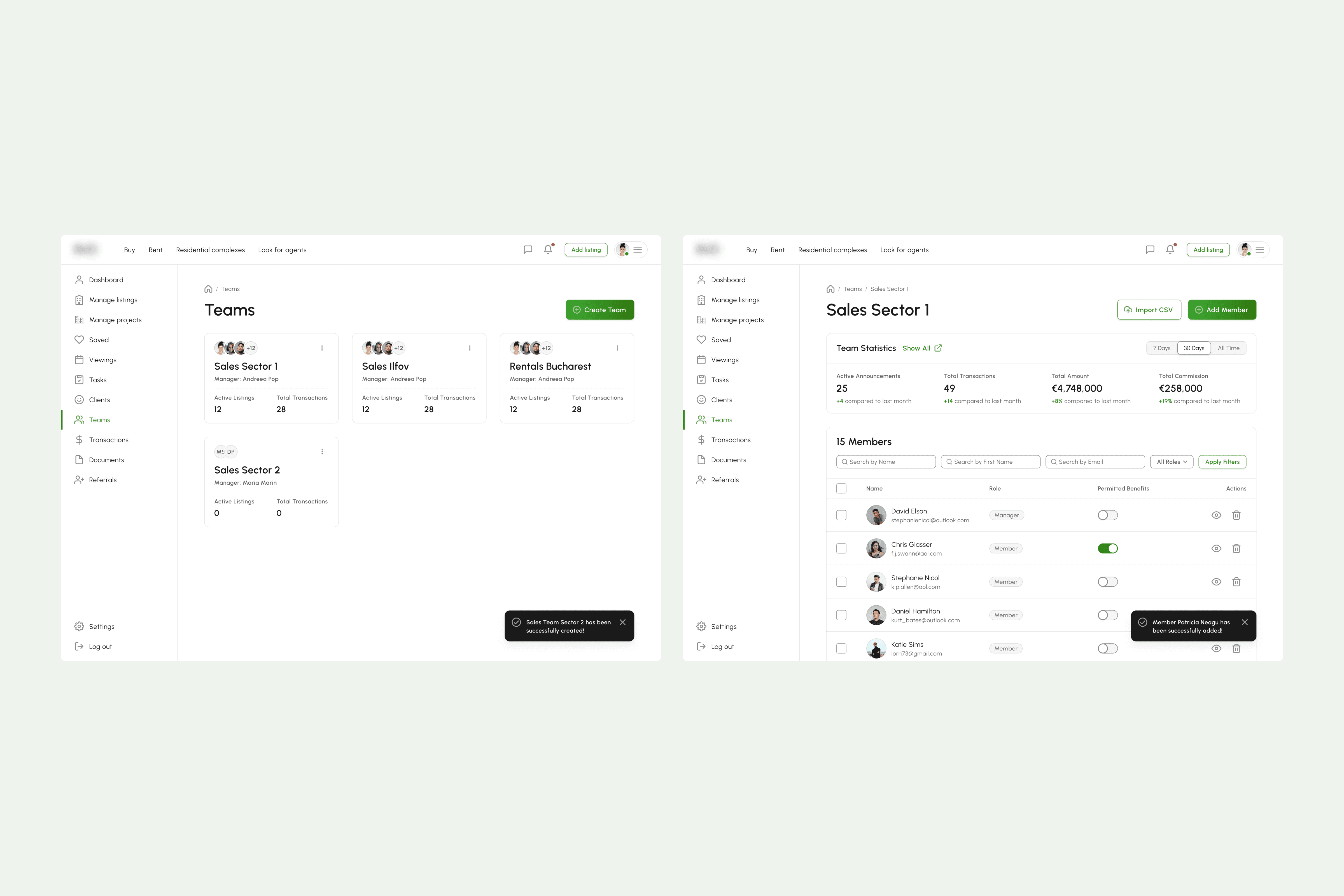
Document and listing management for agents
Additional features were intentionally scoped for later phases. These enhancements will be introduced based on user traction, behavioral insights, and real-world feedback, ensuring the product evolves in alignment with validated needs rather than assumptions.
Key Features & UX Decisions
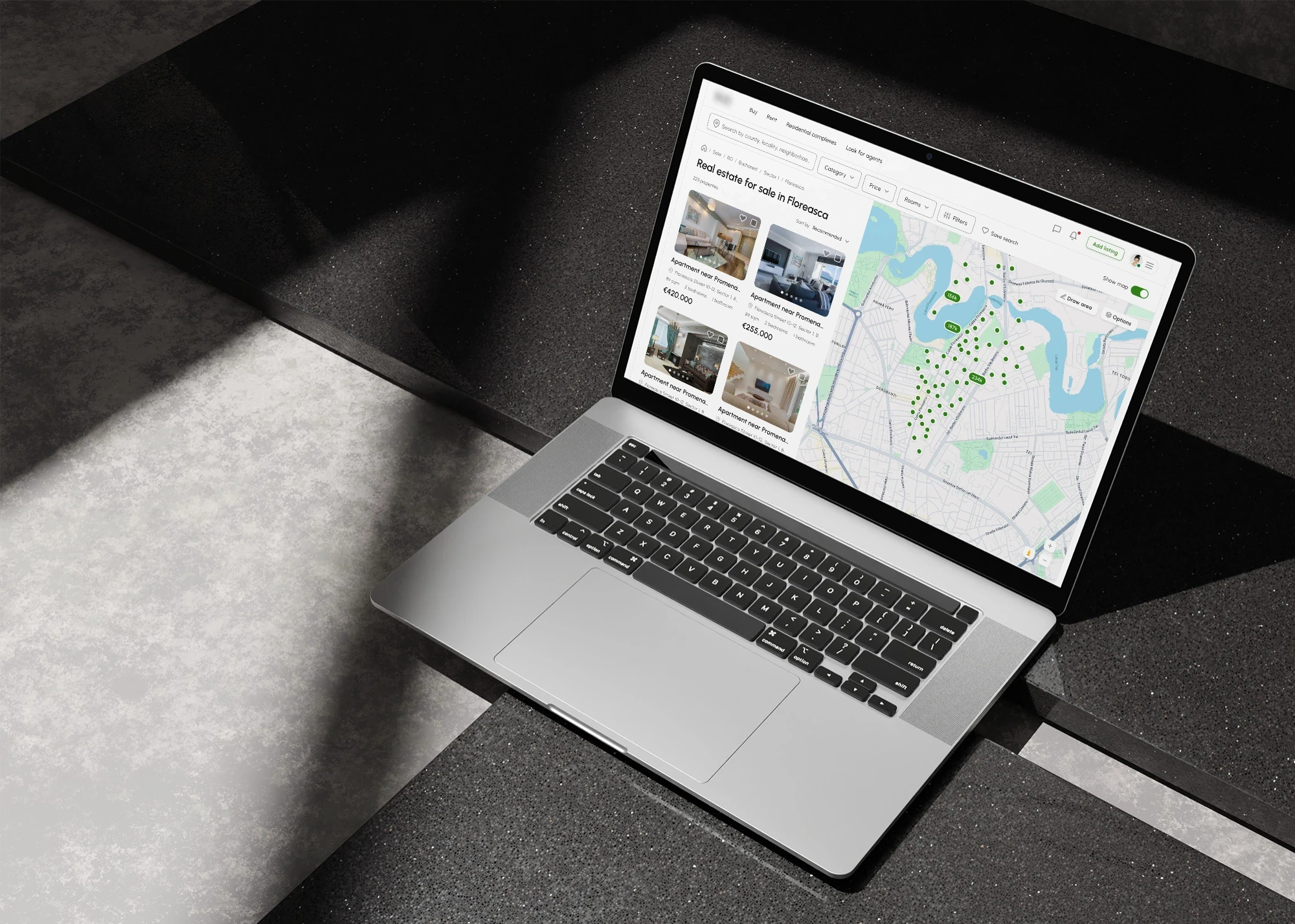
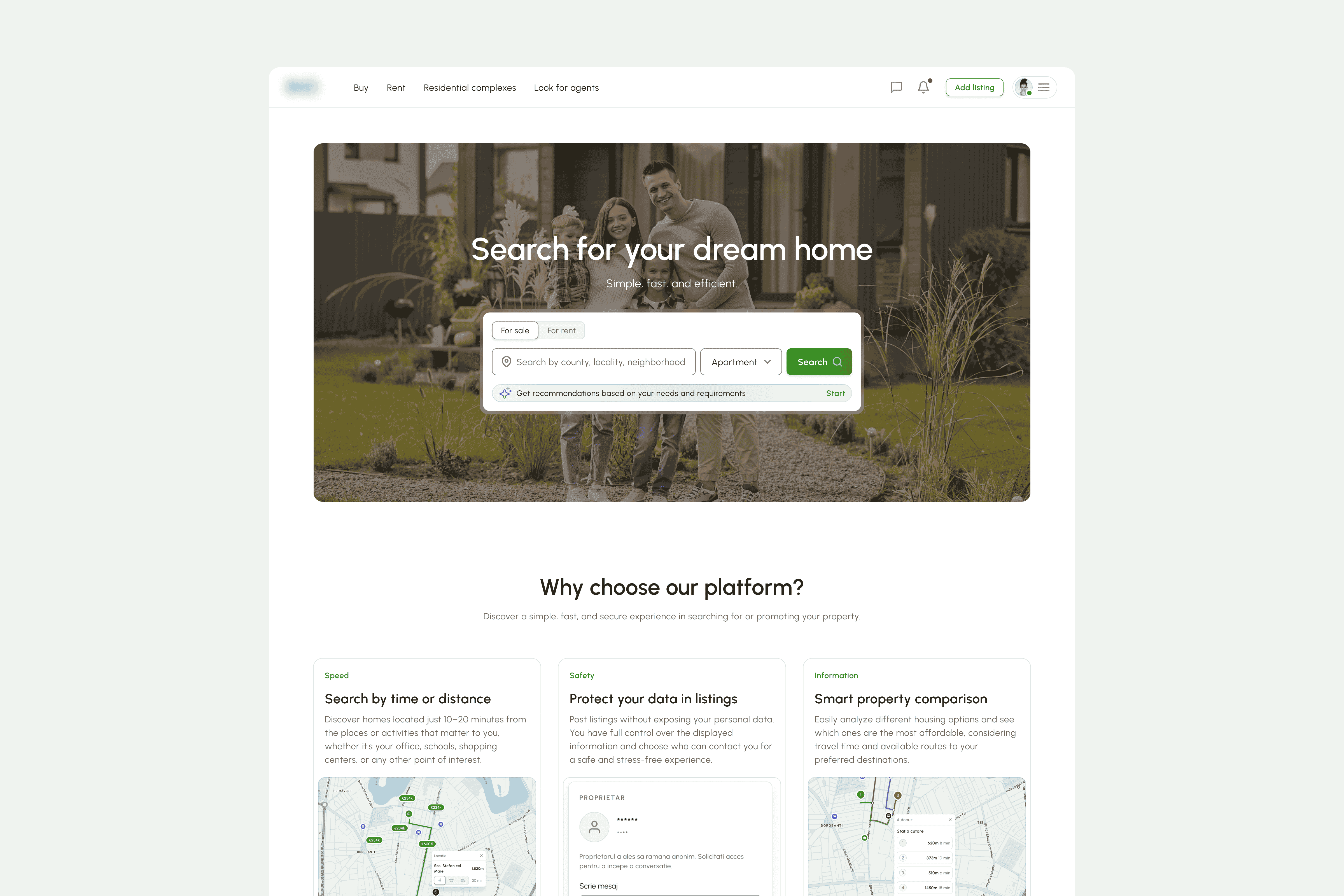
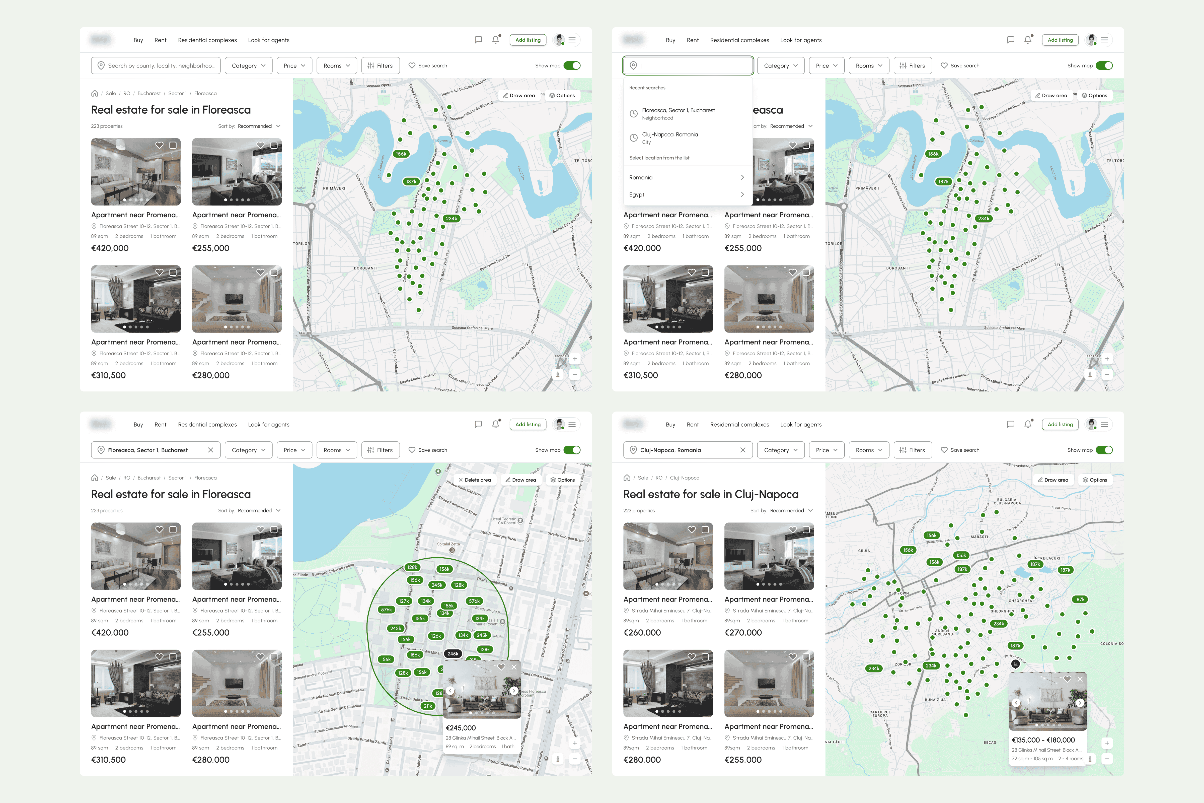
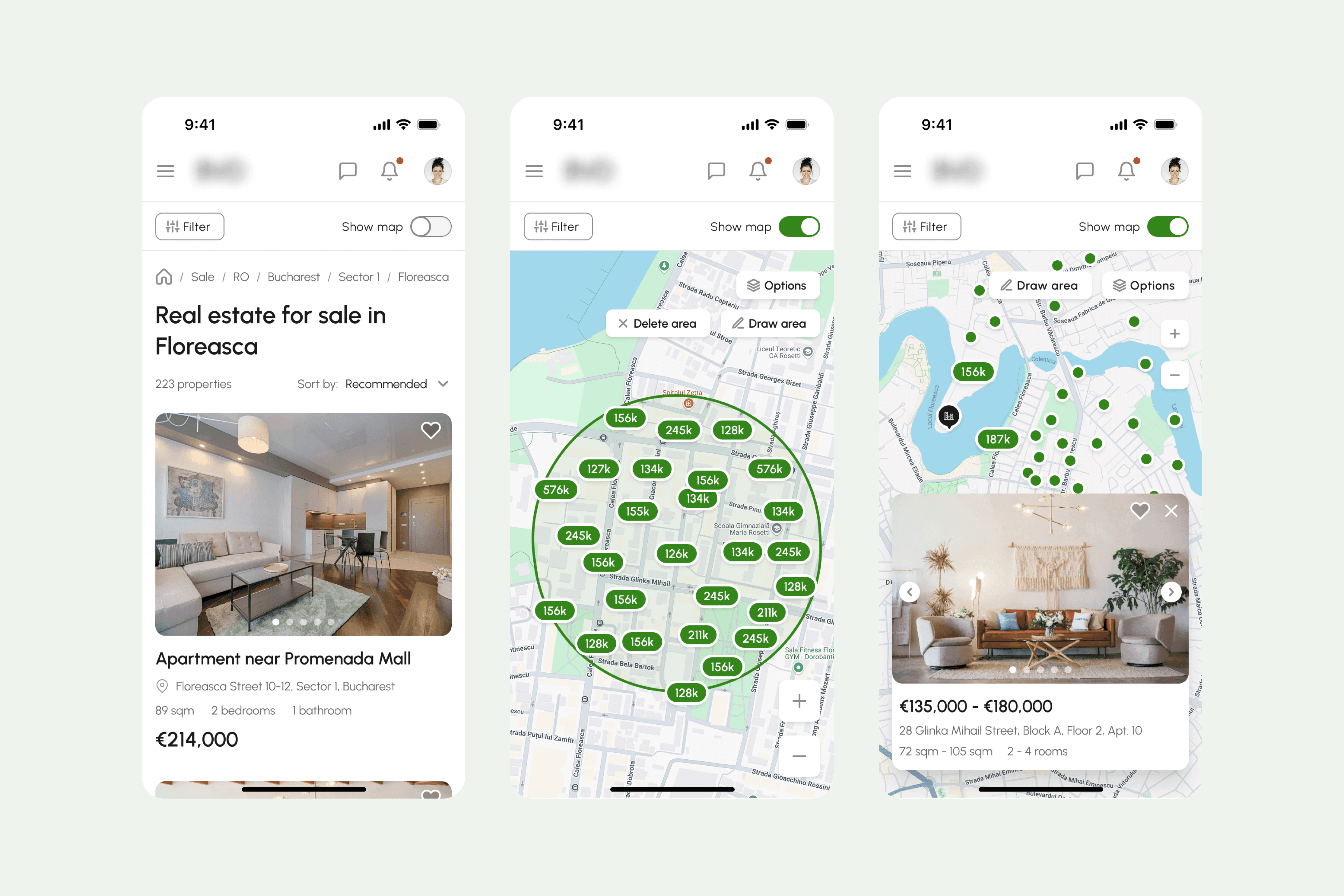
Smart Search & Intelligent Filtering
To accommodate different search behaviors, I designed two complementary discovery paths:
Manual Smart Filters – Users can refine results using structured filters. Initially, only the most commonly used filters are displayed to reduce cognitive overload. Advanced filters are progressively revealed as needed.
AI-Powered Recommendations – An intelligent system analyzes user preferences and behavior to automatically tailor property suggestions, supporting users who prefer guided discovery over manual refinement.
This dual approach balances control with convenience, serving both analytical and exploratory users.
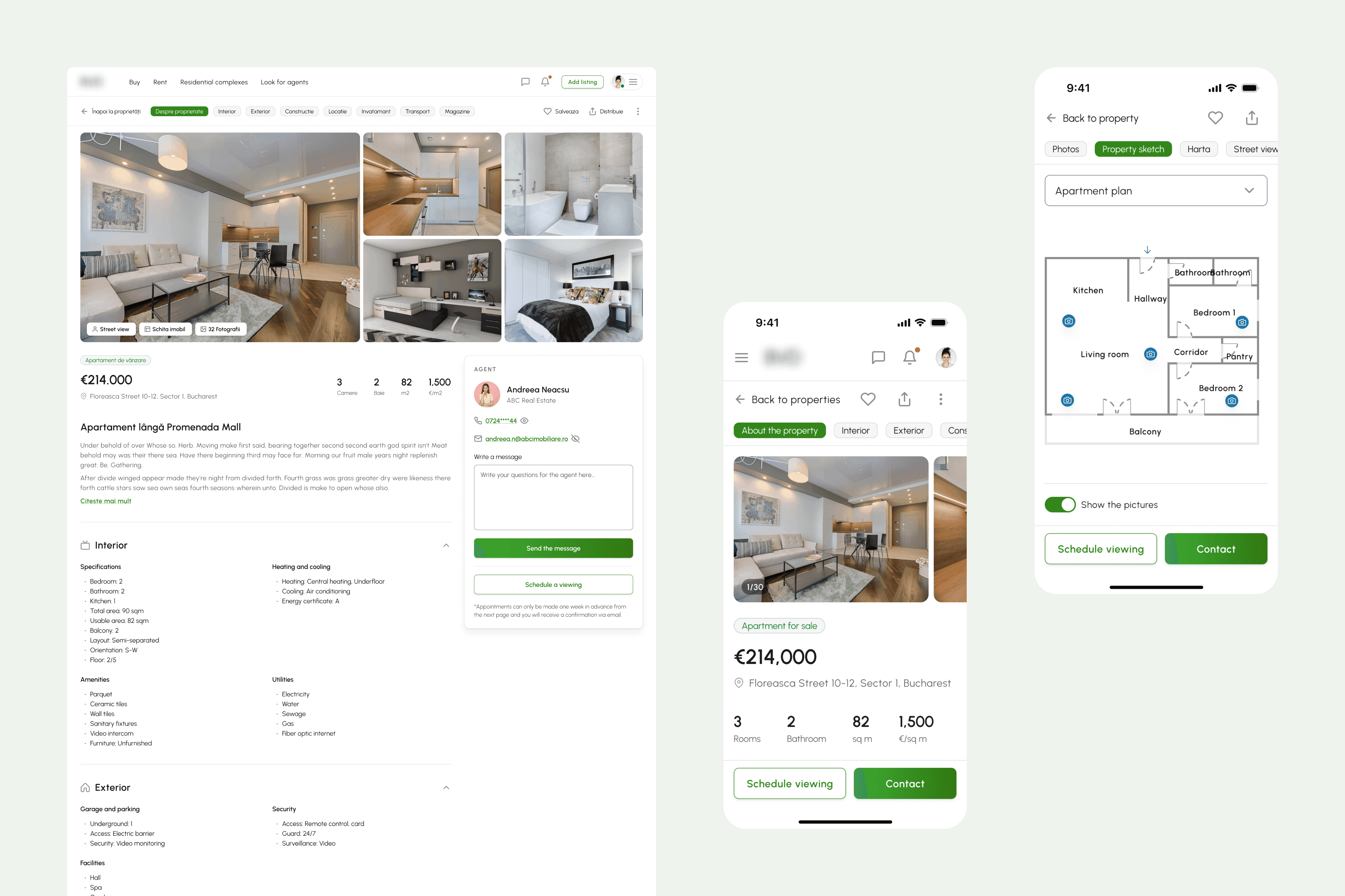
Property Detail Page
The property page was designed to support both emotional engagement and rational decision-making.
Visual-First Hierarchy
At the top, a high-quality image preview (minimum five images) creates an immediate emotional connection and builds trust.
Quick-Access Navigation & Actions
Key sections are accessible through anchored tabs for effortless navigation. High-priority actions — such as Map View, Street View, and Floor Plans — are positioned prominently to reduce friction and increase spatial understanding.
Content Structure (Intentional Hierarchy):
Visual impact (images) → emotional engagement
Core overview (price, size, rooms) → immediate clarity
Detailed specifications → informed evaluation
Location & neighborhood insights → contextual decision-making
Financial tools (e.g., credit simulator) → practical feasibility
This structure guides users from inspiration to validation in a logical, low-friction flow.
To improve conversion:
A sticky contact card remains visible throughout the page
Users can directly schedule a viewing when enabled by the agent
This reduces decision hesitation and shortens the inquiry process.
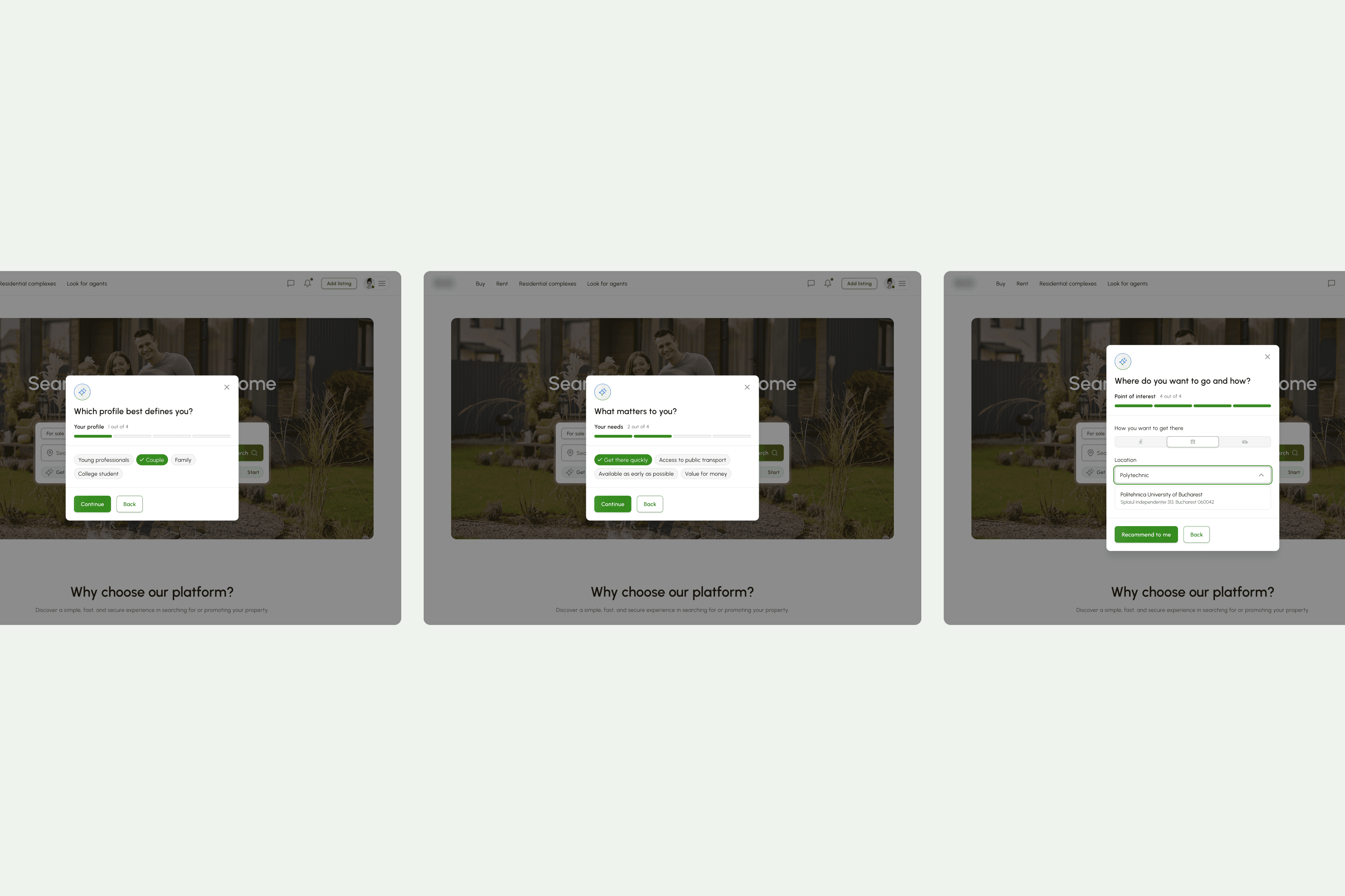
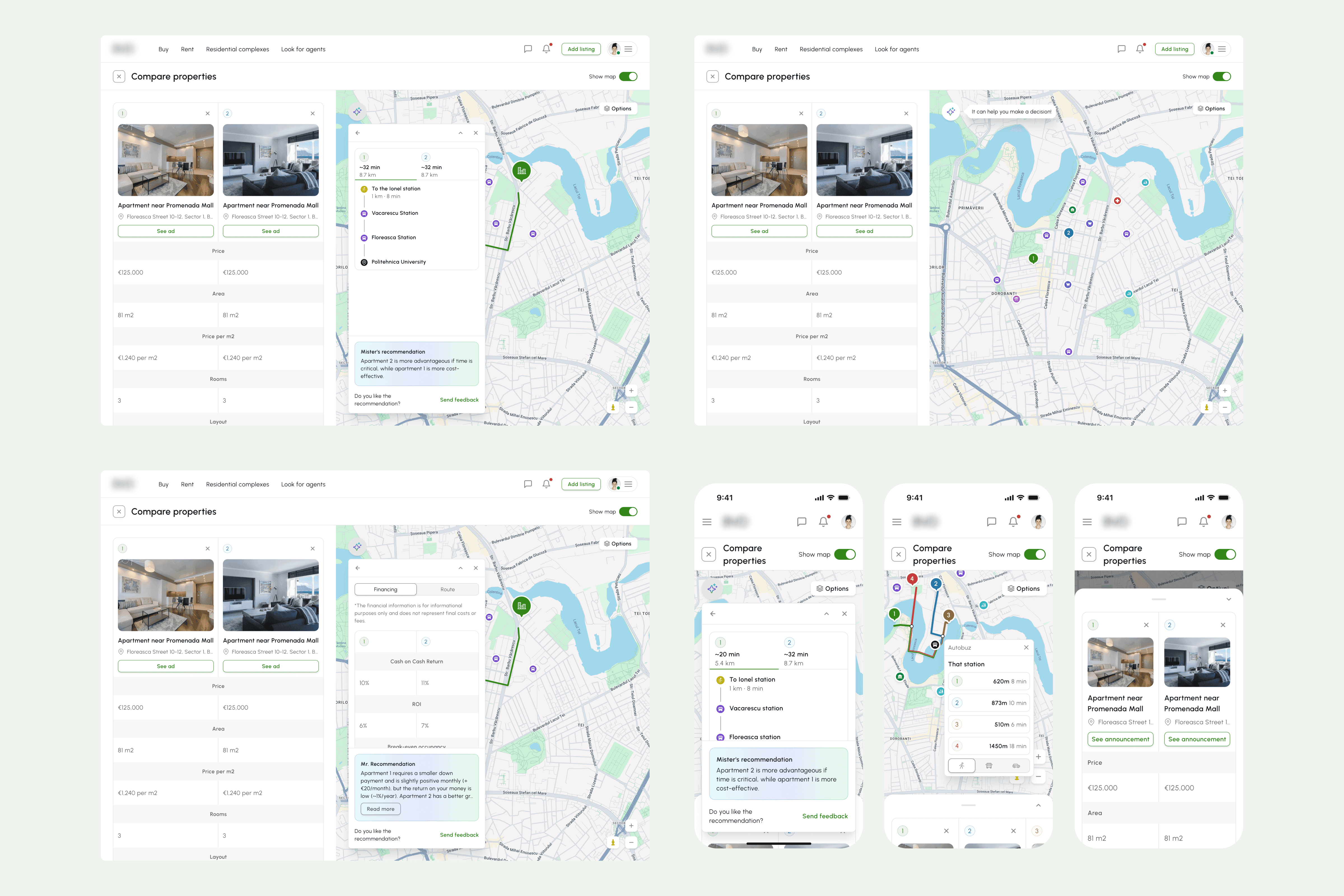
Property Comparison Tool
To simplify complex decision-making, I designed a comparison experience centered around context and personalization.
Map-First Experience
Users can select a key location (e.g., workplace) and instantly evaluate distance and travel time using multiple transportation options. This reframes comparison around real-life relevance, not just property specs.
Guided Multi-Step Flow
A simplified multi-step form captures user priorities, making the comparison process structured and intentional rather than overwhelming.
AI-Generated Insights
Based on selected preferences, the system provides a concise summary highlighting how each property aligns with the user’s needs, turning raw data into actionable insight.
The goal was to transform comparison from a manual, spreadsheet-like task into an intuitive, insight-driven experience.
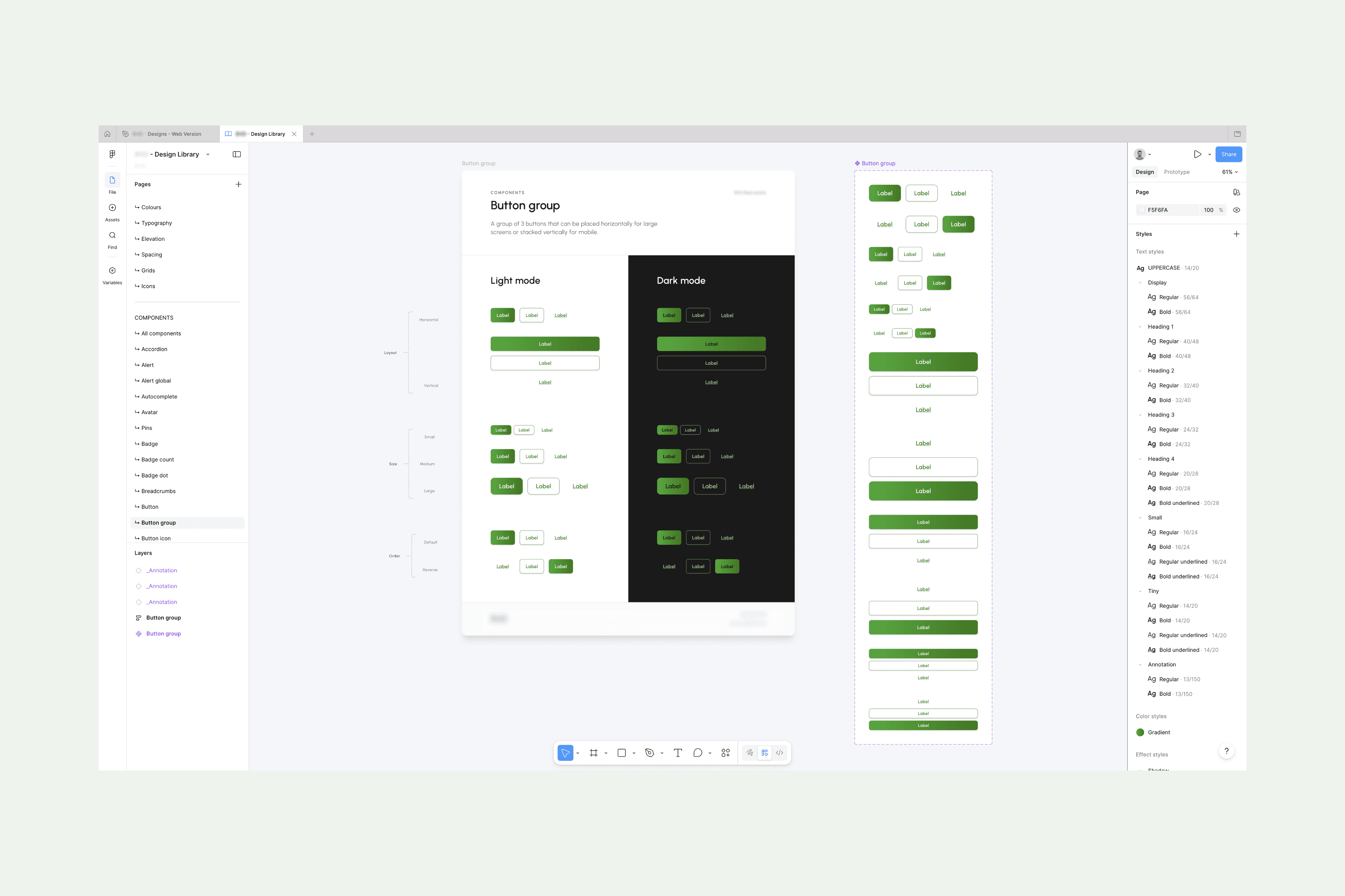
Visual Design System
The design system was crafted to create a modern, trustworthy, and user-focused experience:
Color Palette: Neutral tones highlight property images, while a modern green gradient emphasizes key calls-to-action.
Minimalist Approach: Only essential elements are presented, directing user attention to what truly matters.
Premium Feel: Subtle details and refined typography evoke credibility and trust.
Consistency & Accessibility: A cohesive interface ensures a seamless experience across desktop and mobile devices, adhering to accessibility best practices.
Reflection & Outcome
The most challenging aspect of this project was designing intuitive, streamlined solutions for inherently complex features. While there is still room for refinement, the foundation now supports a clear, user-friendly experience.
Moving forward, the team is focused on increasing platform adoption, while I continue to gather user feedback, analyze behavior, and run A/B tests to iteratively optimize the product. This approach ensures that improvements are data-driven and aligned with real user needs.
Other case studies
Read the other case studies.


