Human-centered UX for automotive diagnostics
Redesigned the OTR Performance app, using in-depth research to deliver a more efficient and user-friendly automotive diagnostic tool.
Industry
Automotive
Year
2021
Role
UI/UX Designer
Platform
iOS, Andorid
Project overview
A client approached me with a clear goal: revamp their mobile app to make it more intuitive, visually appealing, and user-friendly. They wanted to create a seamless user experience that would transform their app into a valuable resource customers would actually enjoy using.
Design challenge
Improve the app's user experience and interface design
Integrate new features like real-time vehicle information
Restructure information architecture for better navigation
Enhance accessibility for all users
Research and discovery
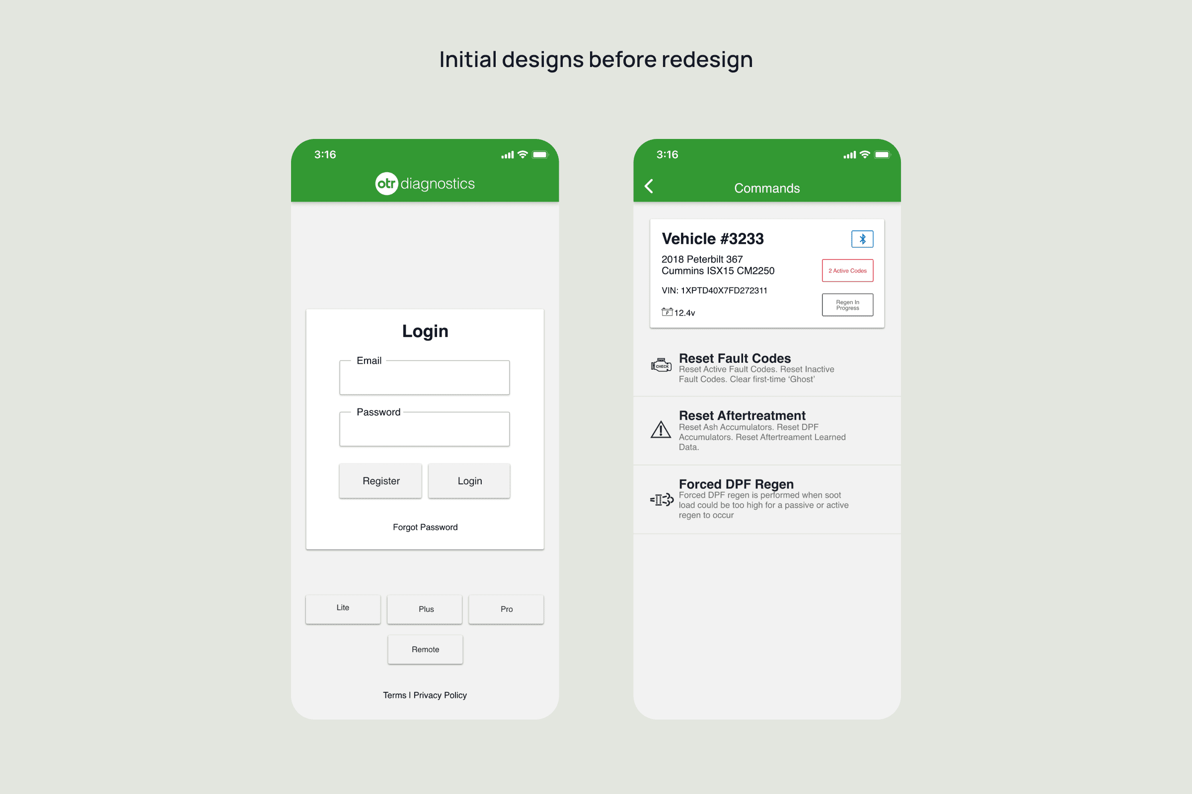
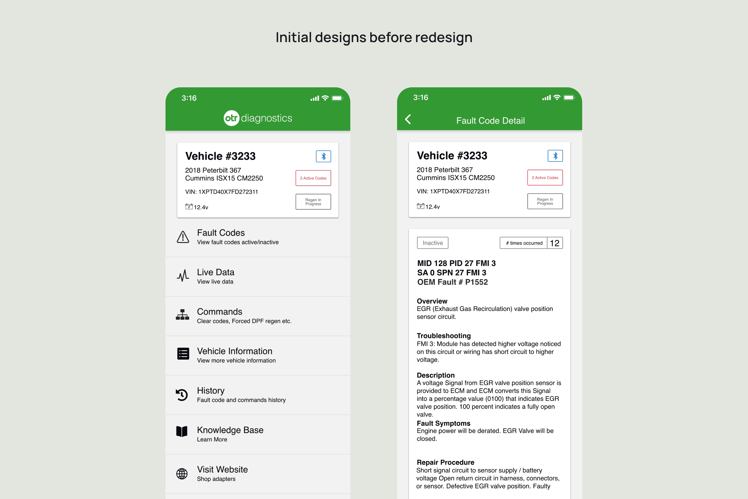
I started by conducting a thorough analysis of the current app to understand its performance and user pain points. Here's what I discovered:
Key Issues Identified:
Text was too small, making content difficult to read
Poor color contrast reduced visibility
Touch targets and buttons were uncomfortably small
Navigation system couldn't accommodate new features effectively
Design Process
Armed with these insights, I developed a comprehensive design strategy:
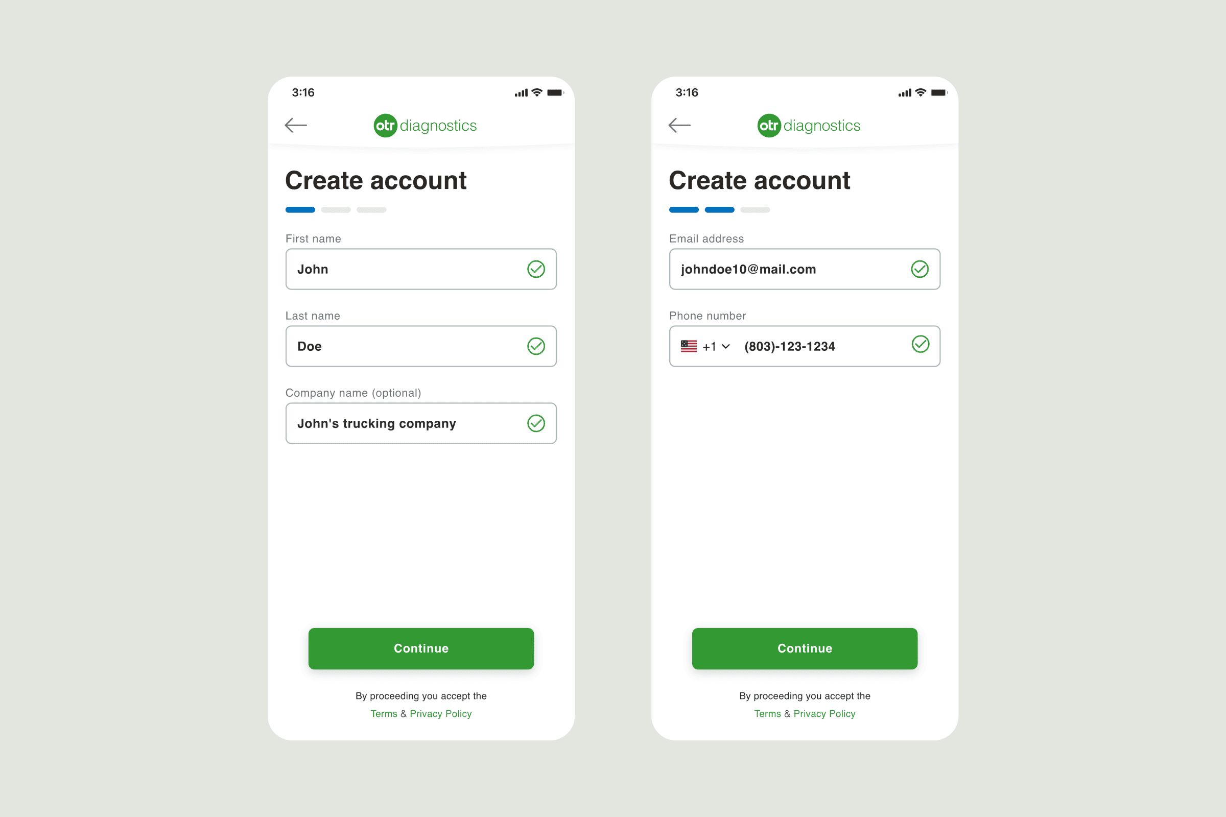
User Stories: I created detailed user stories that prioritized user needs and served as our design roadmap, ensuring every decision kept users at the center.
Information Architecture: I analyzed user journeys and content structure through extensive research and testing to determine the most intuitive and efficient organization.
Wireframing: We developed wireframes to visualize and test different layouts, ensuring our final design would meet user expectations while facilitating clear team communication and decision-making.
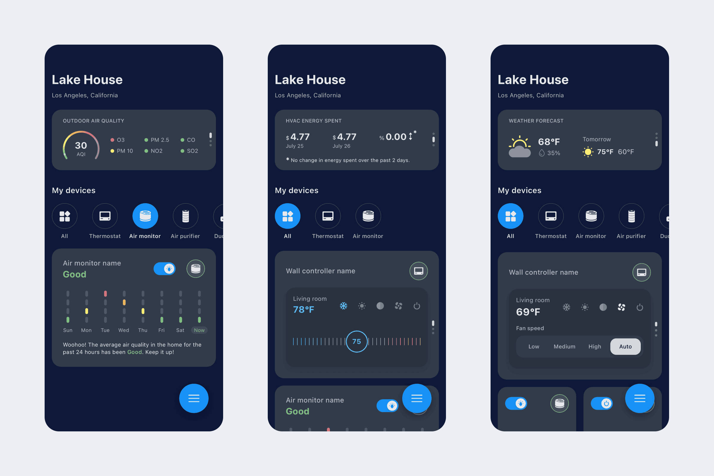
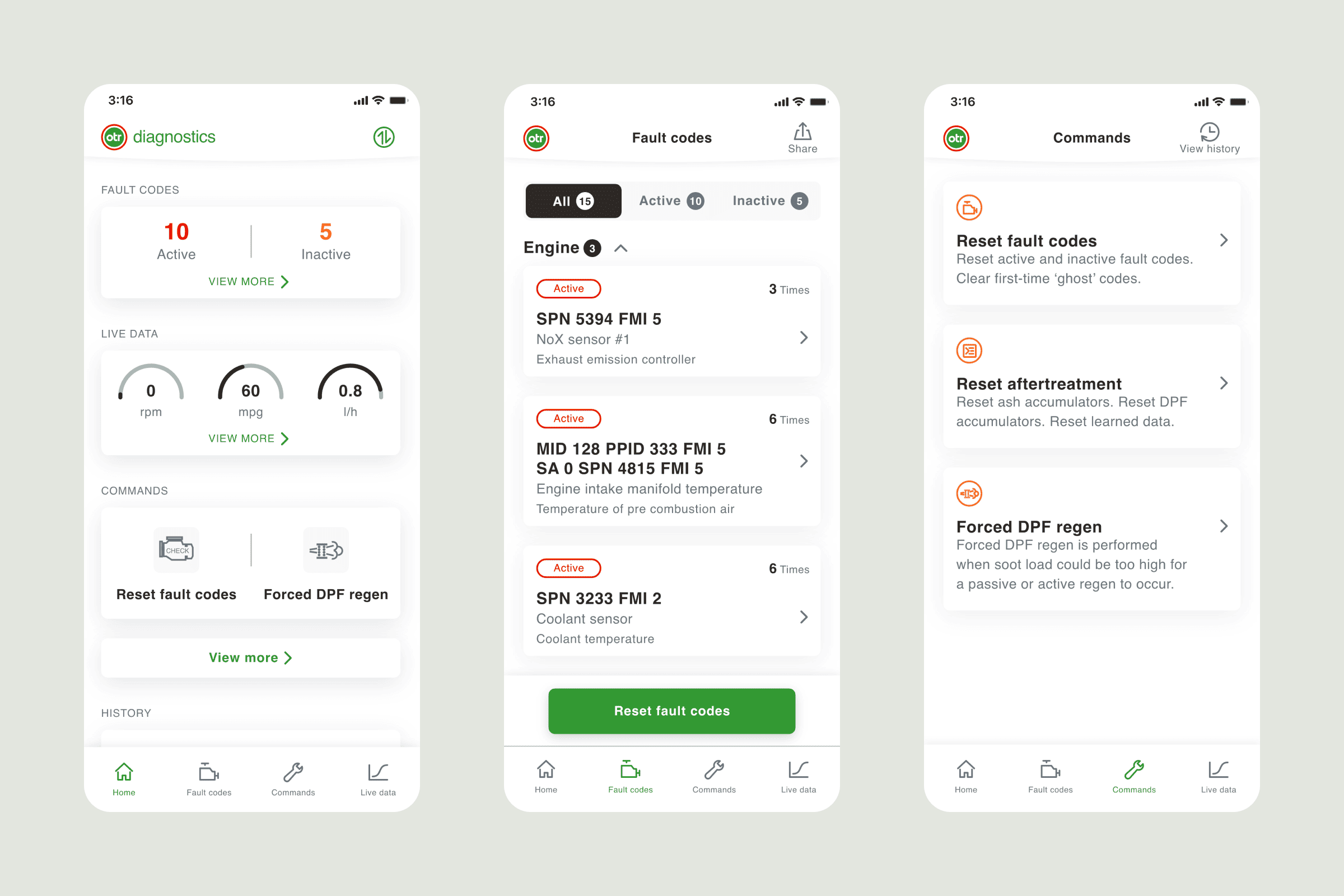
High-Fidelity Design: After finalizing our approach, we created polished, visually appealing designs for each app section.
"Design is not just what it looks like and feels like. Design is how it works." - Steve Jobs
Key design solutions
The redesign addressed core usability issues while significantly improving user engagement:
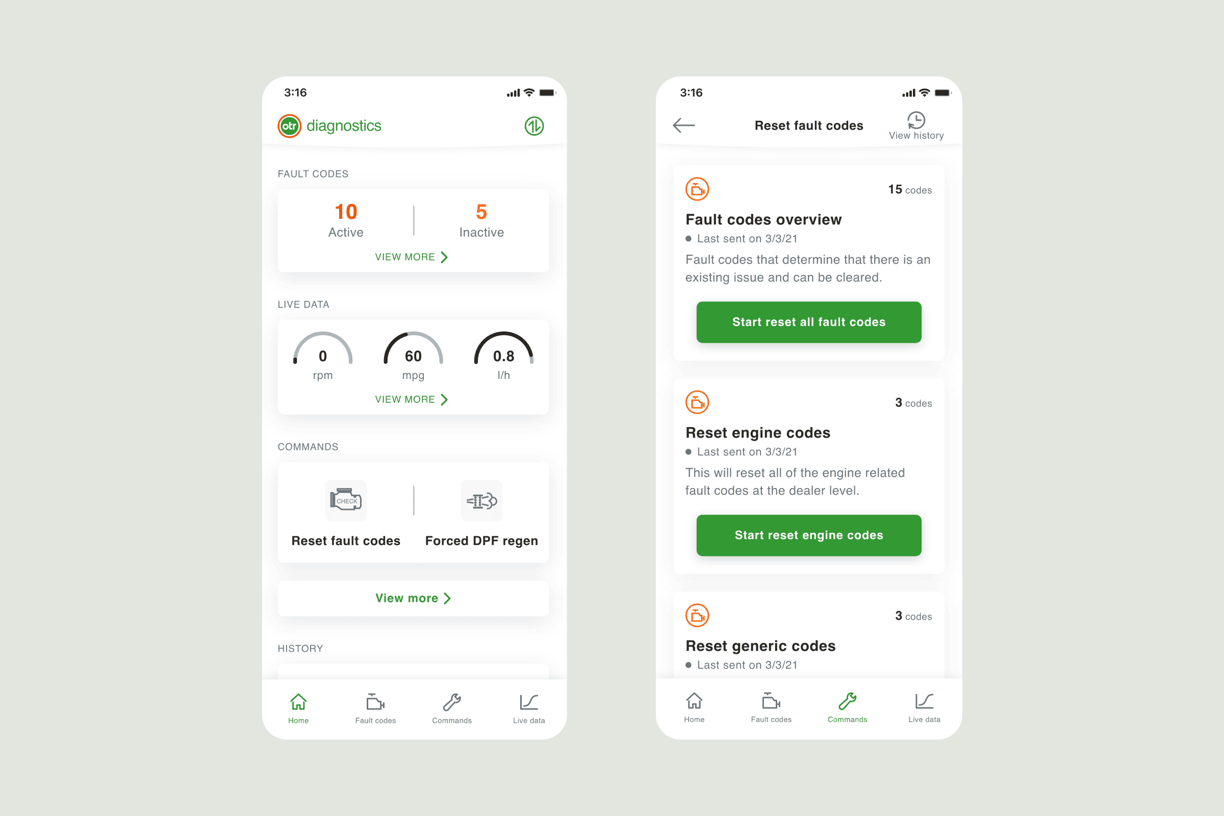
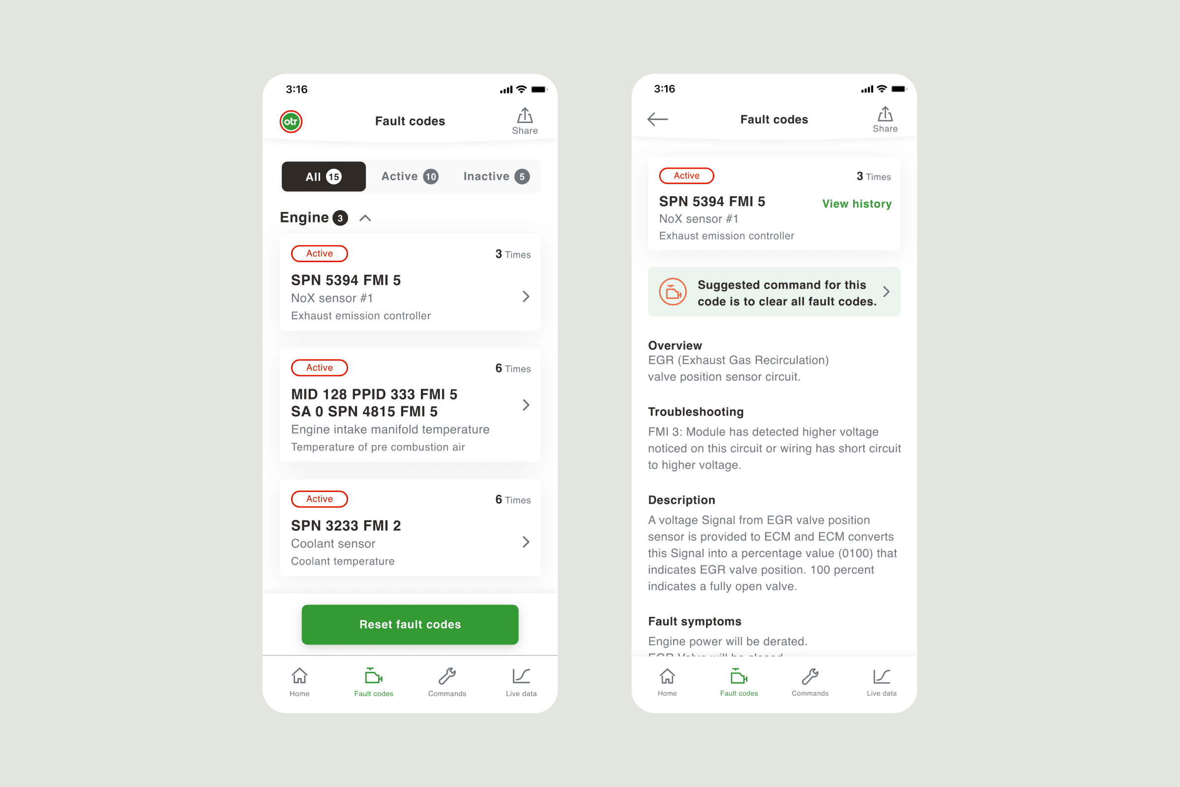
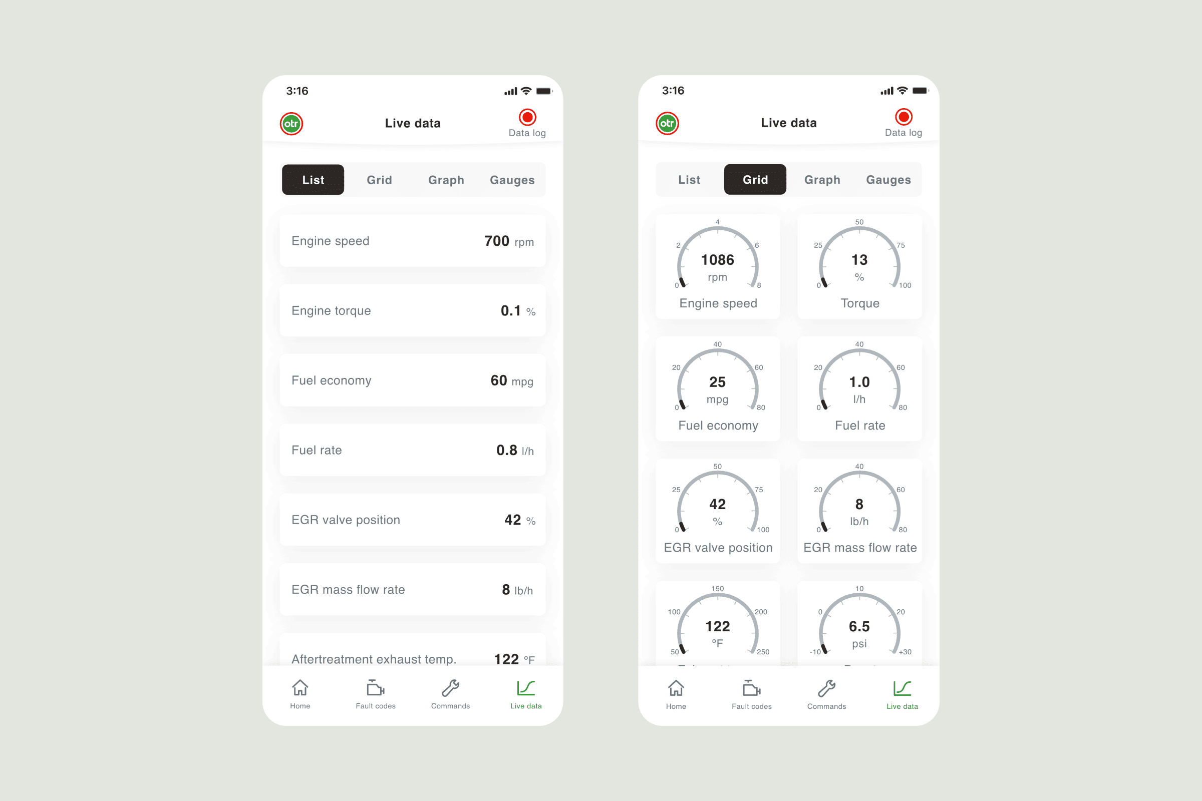
Enhanced Readability: I increased text size and improved color contrast to ensure accessibility for users with varying visual abilities. These changes make the app inclusive and comfortable for everyone to use.
Streamlined Navigation: The new navigation system seamlessly integrates all features, creating a fluid user experience that makes moving through the app effortless.
Improved Interface: I enlarged buttons and expanded touch zones, making the app more accessible for users of all technical skill levels.
Optimized Information Architecture: I reorganized content logically, reducing cognitive load and helping users find information quickly and easily.
Results and impact
Both the client and users responded enthusiastically to the redesigned app. User engagement increased significantly, with higher retention rates and positive feedback confirming that our user-centered approach was successful.
Users consistently praised the app's improved usability, describing it as intuitive and enjoyable to use. The project's success demonstrates how careful attention to user needs and systematic design thinking can transform a product's impact and user satisfaction.