Improving UX, consistency, and accessibility across an esports platform
I joined the team as the sole product designer to evaluate the platform’s current design and user experience. I analyzed the data, gathered user feedback, conducted research, and focused on high-impact, low-effort solutions first. Then, I created a design system and redesigned the platform to address the issues I found, building a solid foundation for further growth.
Industry
eSports
Role
Product Designer
Timeline
7 months
Platform
Web, Mobile
CHALLENGE 01
Consistency &
accessibility issues
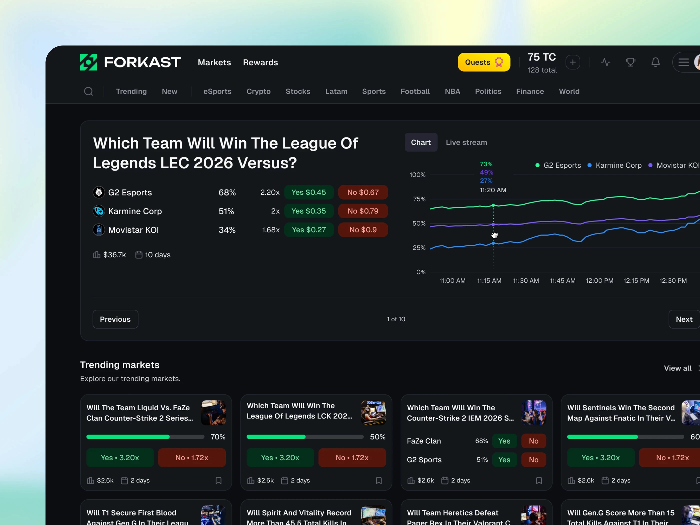
I did a heuristic evaluation of the current state of the overall design and user experience. I found consistency issues in spacing, typography, and components like buttons, as well as accessibility issues with contrast ratios and hover states, all of which decreased the overall user experience of the platform.
A proper design system was not available in Figma or code, so iterations didn’t follow specific patterns, which resulted in design inconsistencies.
Market details page
Before redesign

No buttons hierarchy
Visually similar weight and importance making it unclear which is the primary action for the user.
Hard coded colors
No tokens available for the colors, creating inconsistencies between different elements.
Inconsistent typography
In this example with the highlighted buttons it is clearly visible the font properties is different.
Different spacing & sizing
The buttons were not created as a reusable component, creating inconsistencies.
SOLUTION 01
Created a scalable
design system
I decided that a scalable design system was needed to solve the issues I found and make the platform feel more modern and premium.
At first, I prioritized quick fixes that had a high impact before starting to work on the design system and recreate the platform components.
I used best practices to redesign the components to be scalable, accessible, and consistent.
Because the light theme in the original design was not accessible, I created the design system with tokens to easily support both dark and light themes while meeting accessibility standards.
Market details page
After redesign
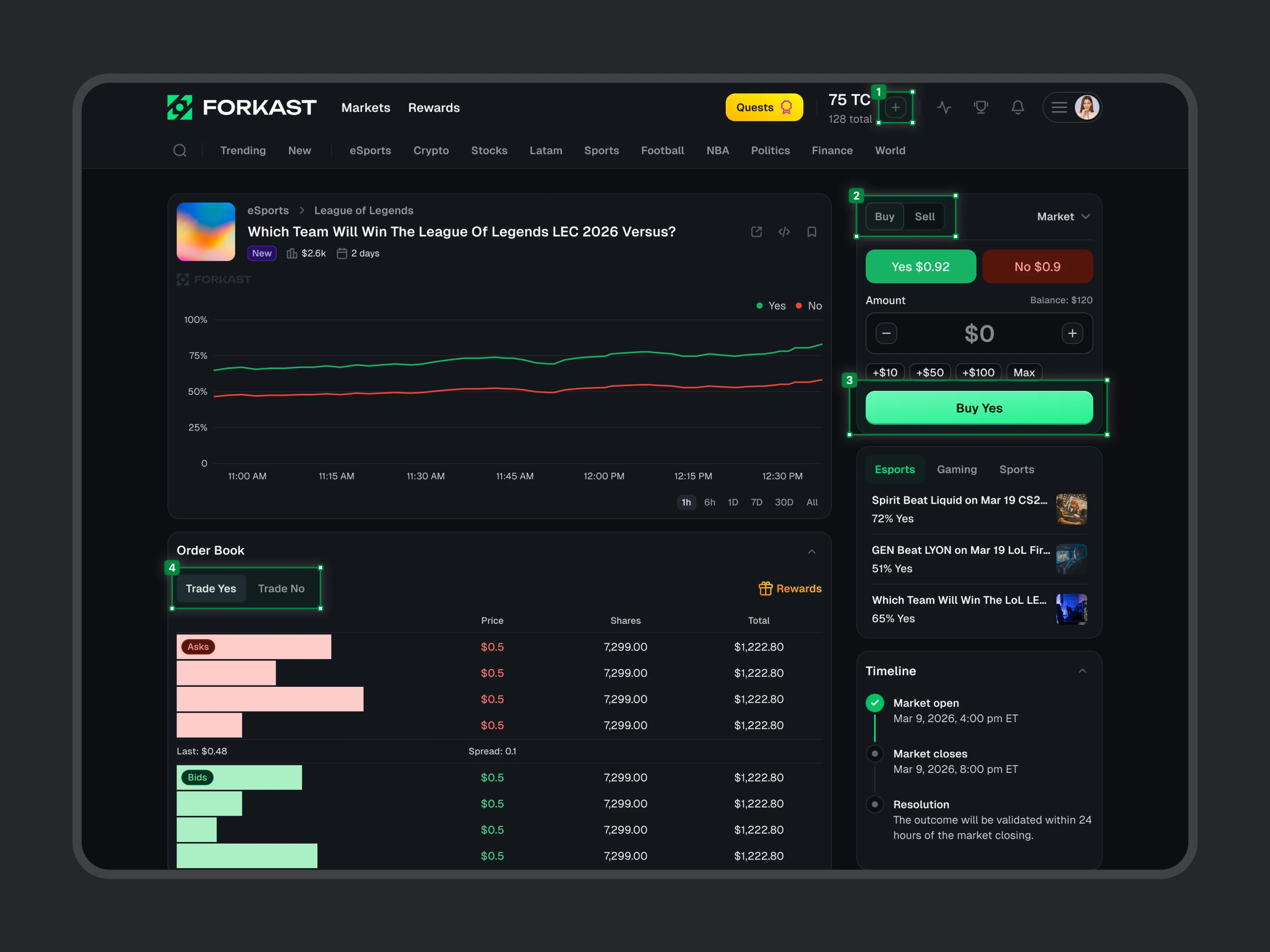
Deposit button
It was replaced with a secondary icon button because it was not a main action when users already had an available balance.
Order type
The switch for the buy/sell order type was replaced with a tab bar.
One primary action
The new primary button was used for the main action to buy/sell.
Order book view
The view between Yes and No was replaced with simple tab buttons.
IMPACT 01
Modern, consistent &
40% faster development
The new design received very positive feedback from users on Discord, team members, and investors alike. It increased user satisfaction and decreased development time by 40%, while making the platform more scalable and consistent for future iterations and growth.
CHALLENGE 02
Homepage space was underutilized limiting the exploration for markets
The maximum width of the homepage was too small and didn’t utilize the available space on larger desktop monitors efficiently.
The hero banner didn’t provide much value for users. Most users were clicking the button to go to the market category pages, creating friction and not making the most out of the section.
Home page
Before redesign

SOLUTION 02
Homepage space was underutilized limiting the exploration for markets
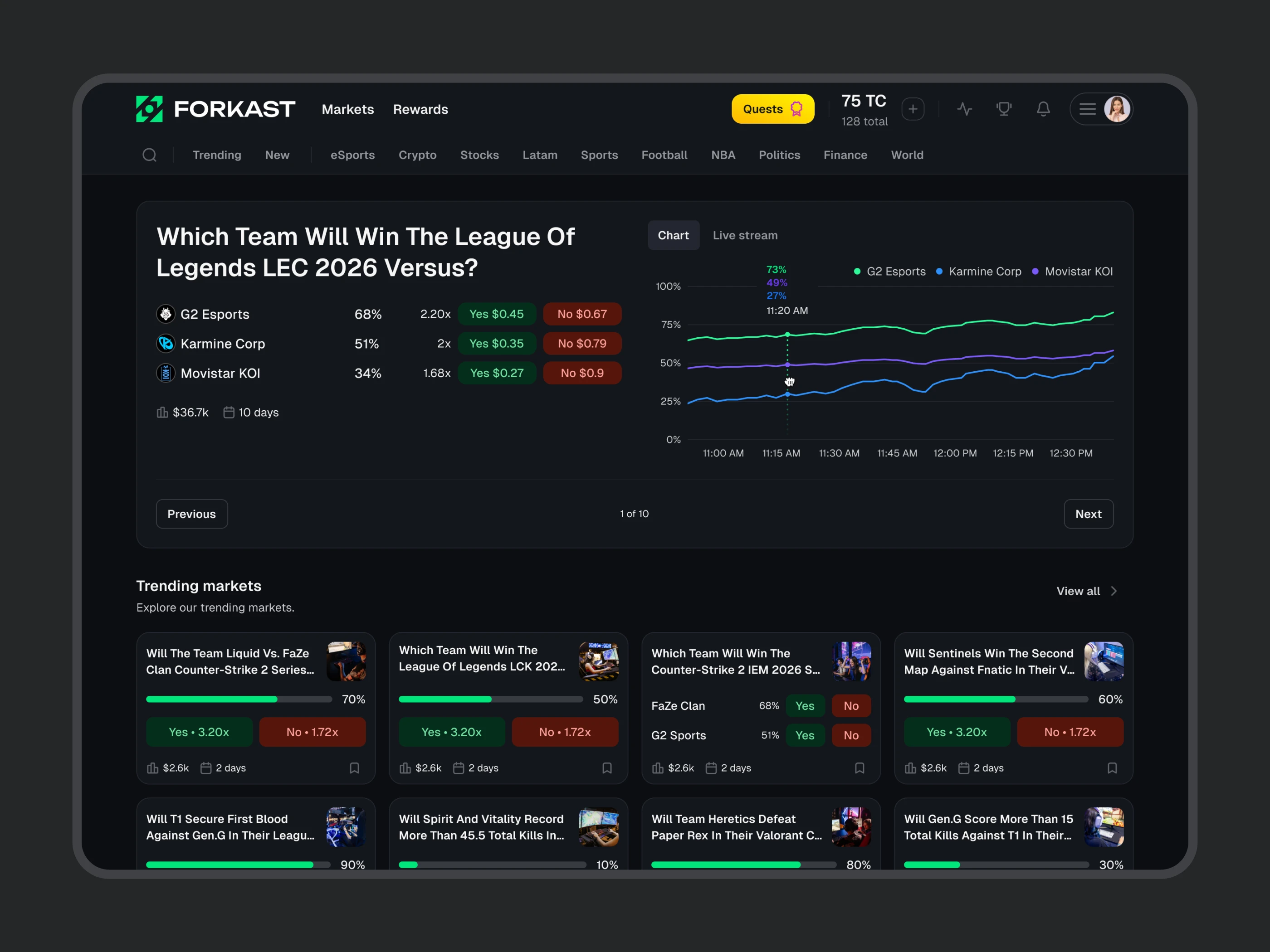
I increased the maximum width of the homepage to make more room for a new hero slider banner featuring live or popular markets, as well as a 4-column grid for the market cards.
From the data, I found that users were using the slider banner to explore markets, so I decided to provide more value by showing market outcomes and a live chart to help users make better-informed decisions.
Home page
After redesign
SOLUTION 02
One click to open
order widget
To reduce friction when placing an order, the Buy and Sell buttons opened a pop-up with the order widget, allowing users to place an order directly on the page without interrupting their context.
This reduced the order placement flow by one step and decreased the loading time, resulting in faster task completion than before.

CHALLENGE 03
Crowded main navigation with too many actions
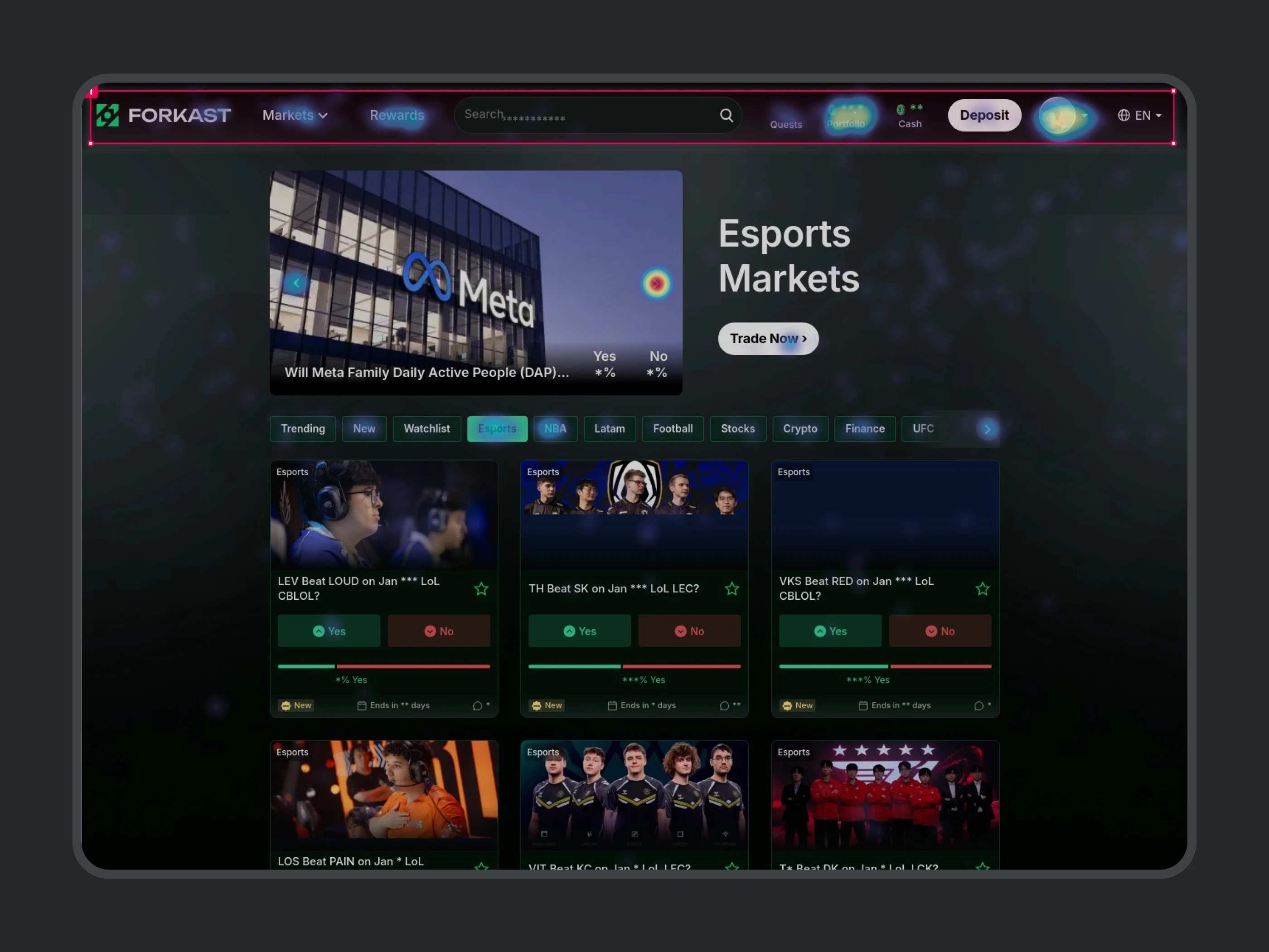
The main top navigation had multiple action elements competing for users’ attention, creating information overload and friction.
On smaller desktop screens, the navigation was crowded, with not enough space between elements, increasing the chance of errors.
The founder and other team members wanted to introduce a few more features and actions to the navigation, such as quests and notifications.
Adding more action elements would make the navigation even more crowded and further decrease the overall UX.
Main navigation
Before redesign
SOLUTION 03
Prioritized user main actions
& remove less used ones
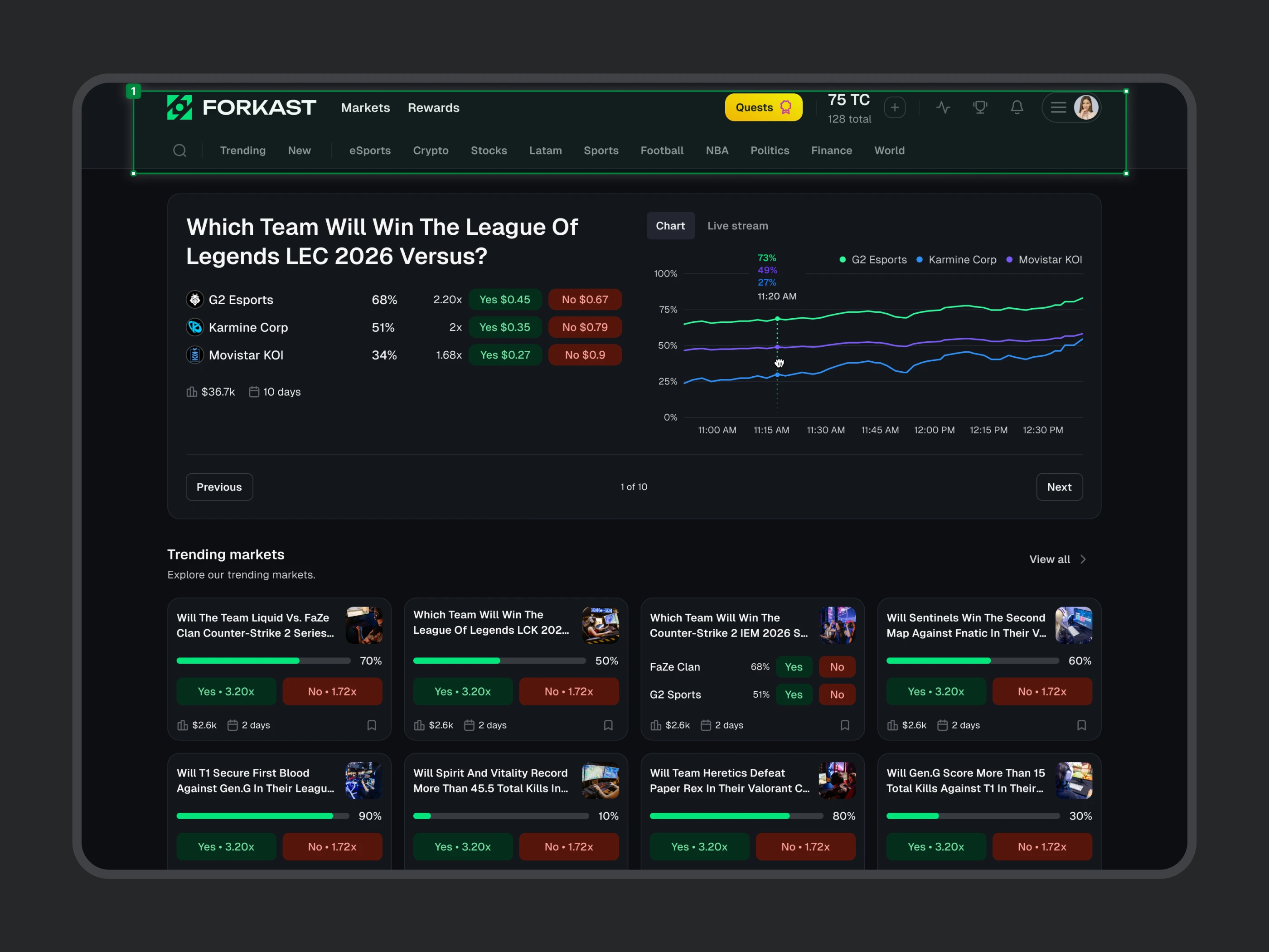
I decided to look at user data to identify the most-used actions and prioritize them on the first level, while using progressive disclosure for secondary and tertiary actions in the dropdown menu.
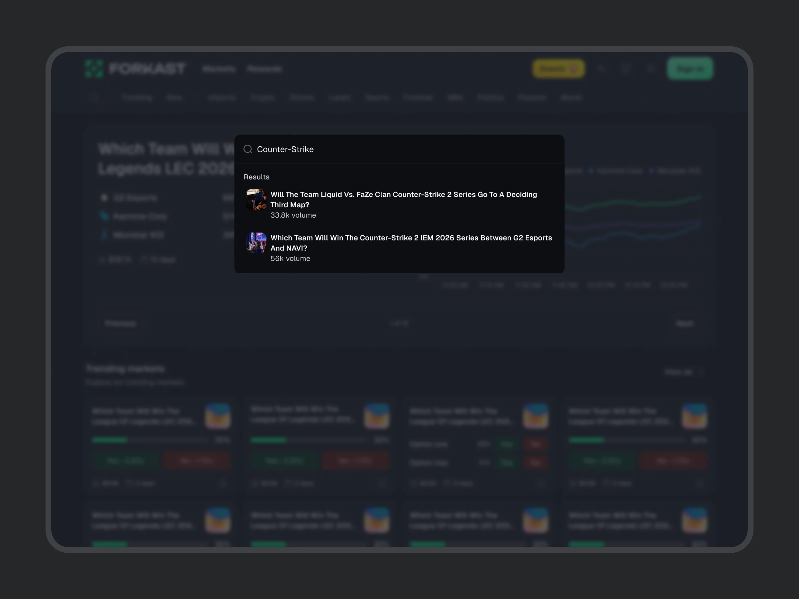
From the data, I found that the market search bar was used by ~1% of users. I decided to redesign it using a search icon to take up less space and move it to the secondary navigation, alongside the market categories, since it was related to them.
On click, a popup with a search field appeared, emphasizing the search functionality when needed. This change freed up space in the main navigation bar.
Main navigation
After redesign
IMPACT 03
Reduced information overload
After the redesign the main navigation is clearer for the user, focusing on the main actions that they want to take.
More accessible by providing hover states with tooltips for each action element, so the user knows what each button does in the initial phase.
Responsive & usable on smaller screens.
CHALLENGE 04
Inconsistent market category navigation
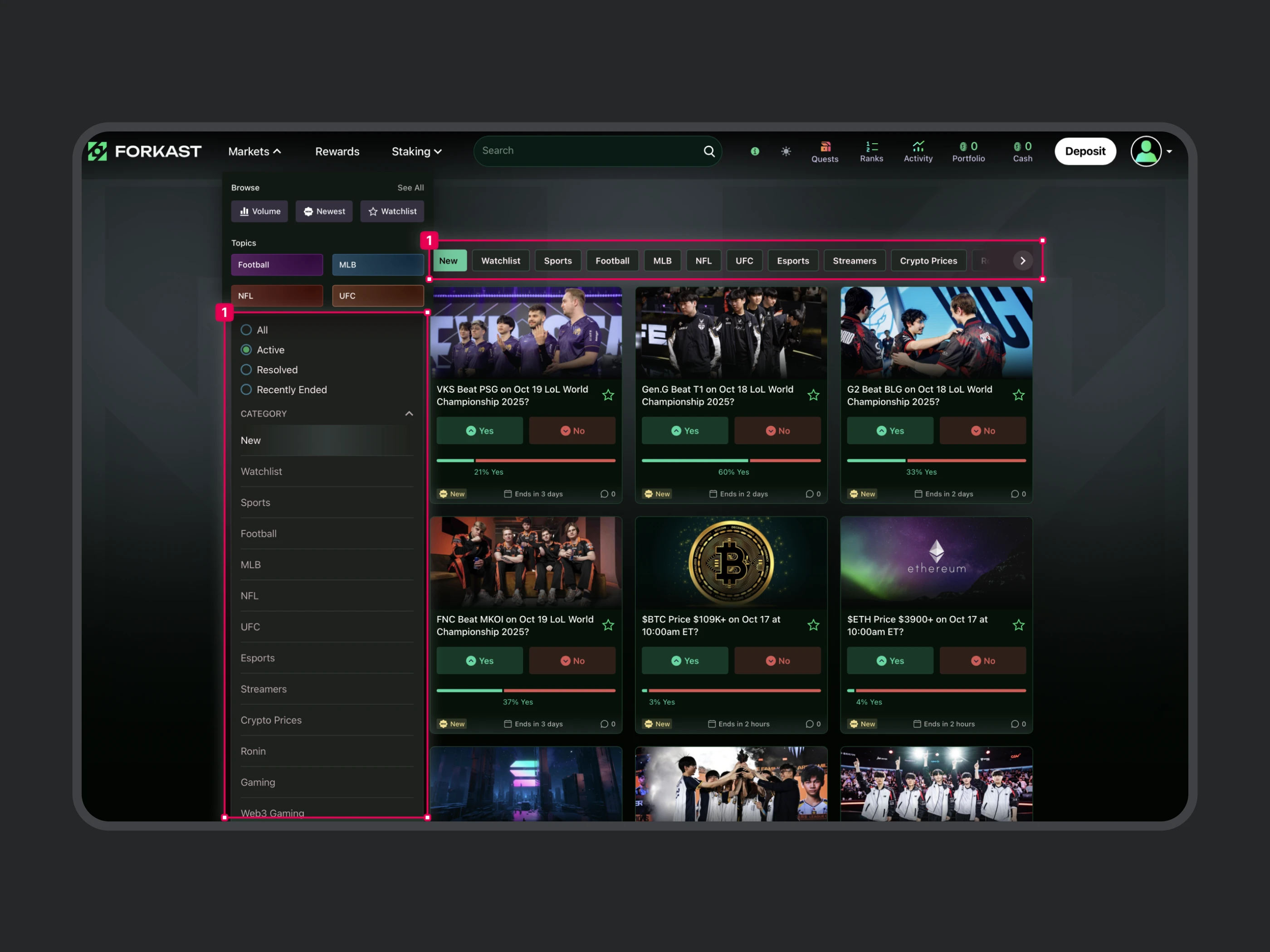
The market category navigation was inconsistent between some categories, interrupting the user flow.
On scroll, it was no longer visible, forcing users to scroll back up to change categories on the homepage.
There was also double navigation on the market category page, creating confusion and taking up valuable space.
Category page navigation
Before redesign
SOLUTION 04
Category navigation at the
top visible at all times
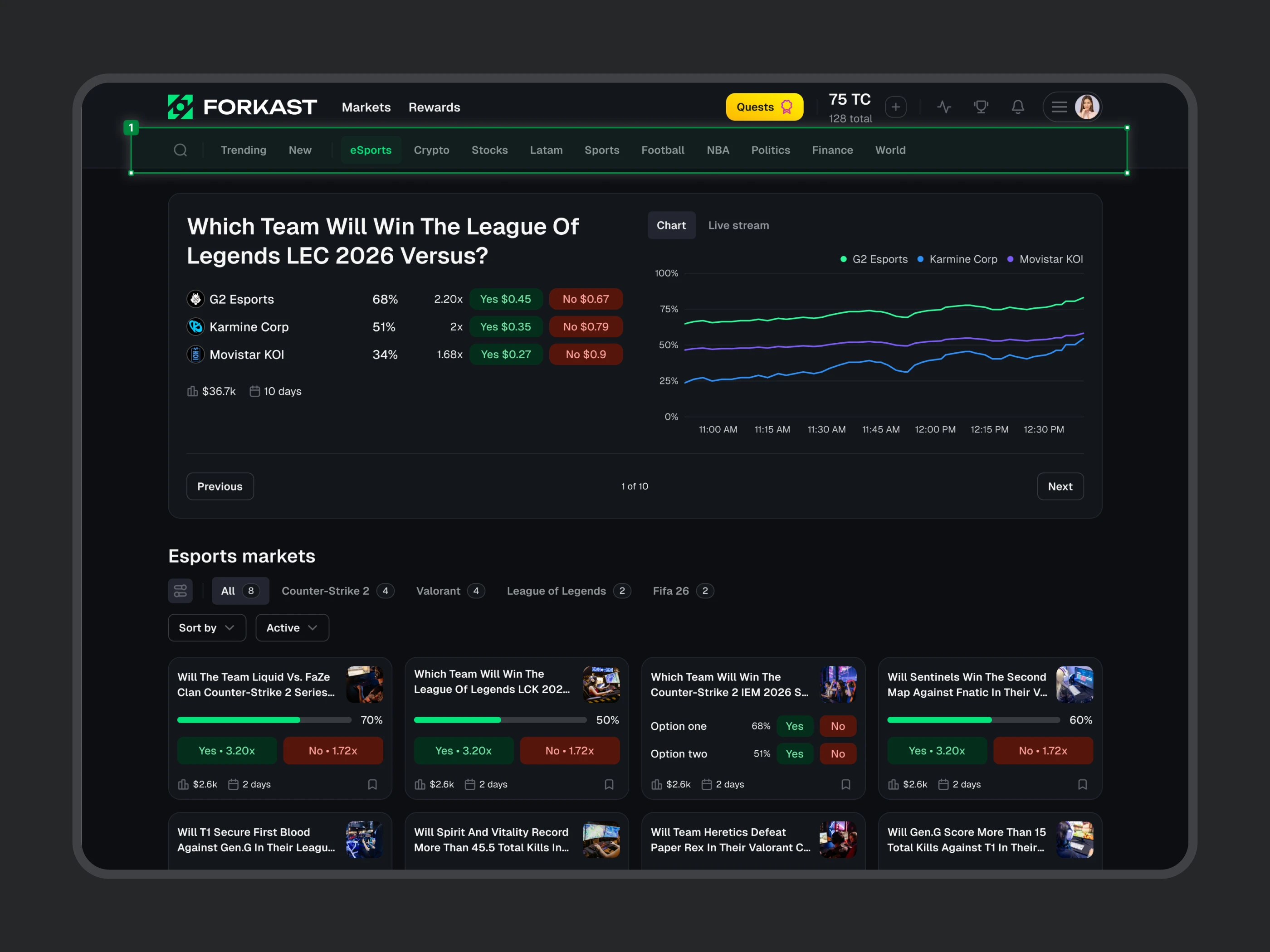
I decided to create a tab bar as a secondary navigation below the main top navigation, keeping it consistent across categories and visible at all times.
The sub-category filters were moved below the category page title, along with the filters that were visible only when needed.
Category page navigation
After redesign
IMPACT 04
Intuitive and consistent category exploration
This change resulted in faster market exploration and more consistent category navigation.
Allowed the users to explore different market categories without changing context or pages.
More space to have 4-column grid for the market cards.